
The Challenge
Vision RCL had grown to include multiple services and sub-brands, each developed independently. The organisation needed a unified brand system that could bring clarity, consistency and confidence, while still allowing each service to express its own character.
Our Approach
We began with a series of Discovery Workshops, working closely with teams across Vision RCL’s service areas. These sessions helped us understand the breadth of their offer, align stakeholders around purpose, audience and ambition, and uncover the shared principles that connect every service. This insight formed the foundation for a refreshed brand designed to flex confidently across services, platforms and teams.
What we did
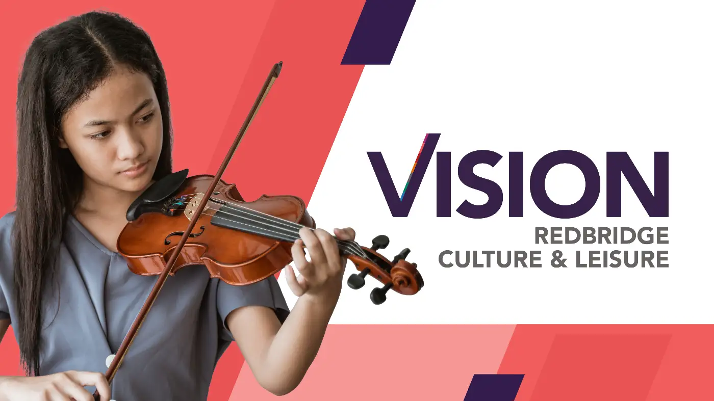
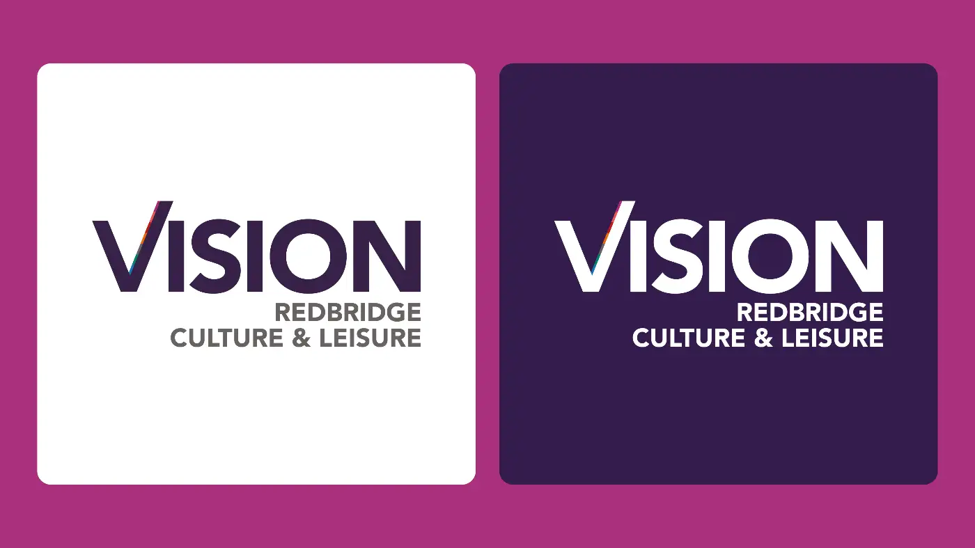
We refined Vision RCL’s tone of voice, redesigned the logo and introduced a vibrant, confident colour palette to bring clarity and consistency to the brand.
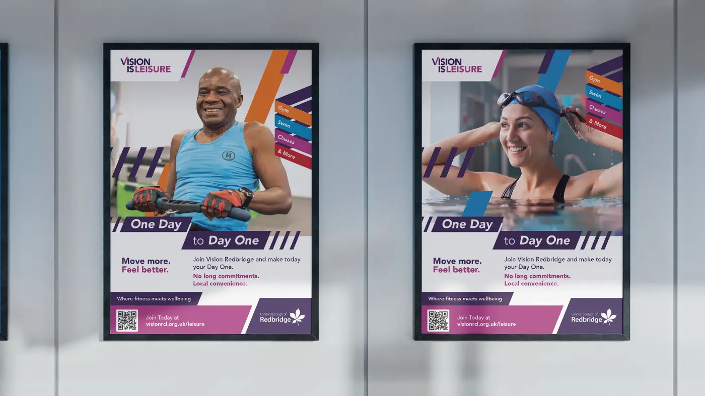
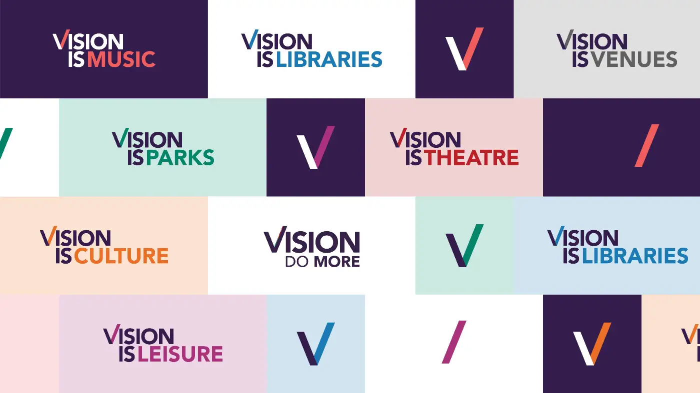
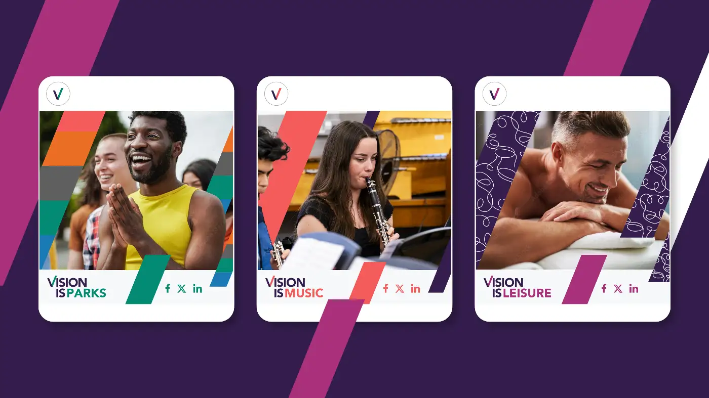
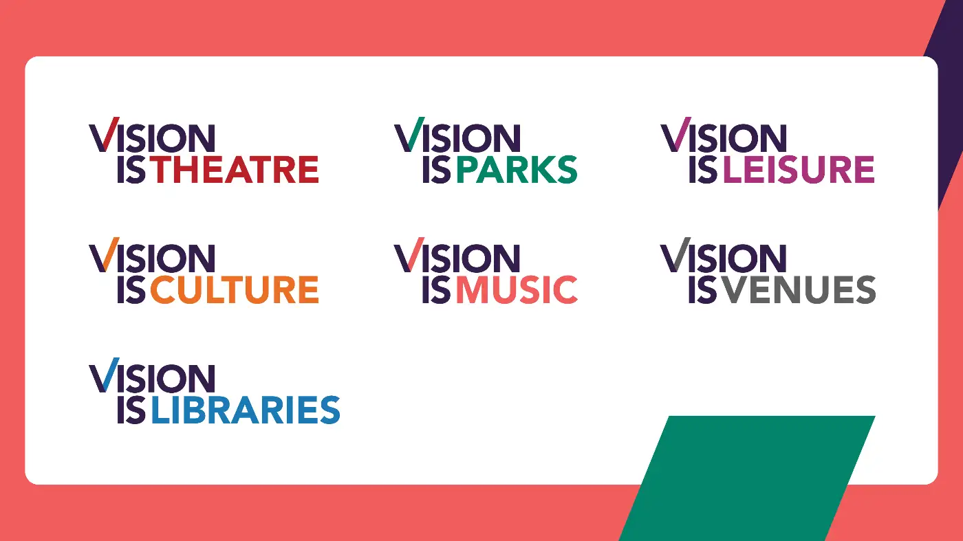
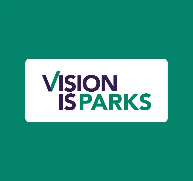
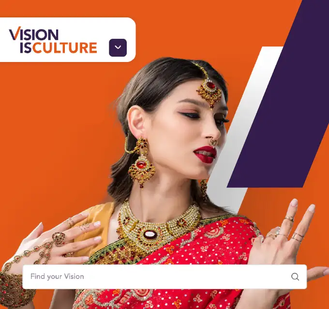
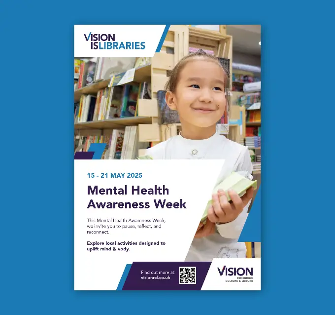
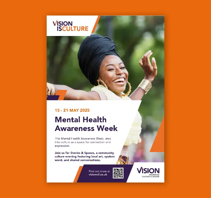
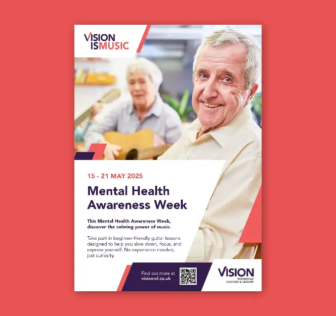
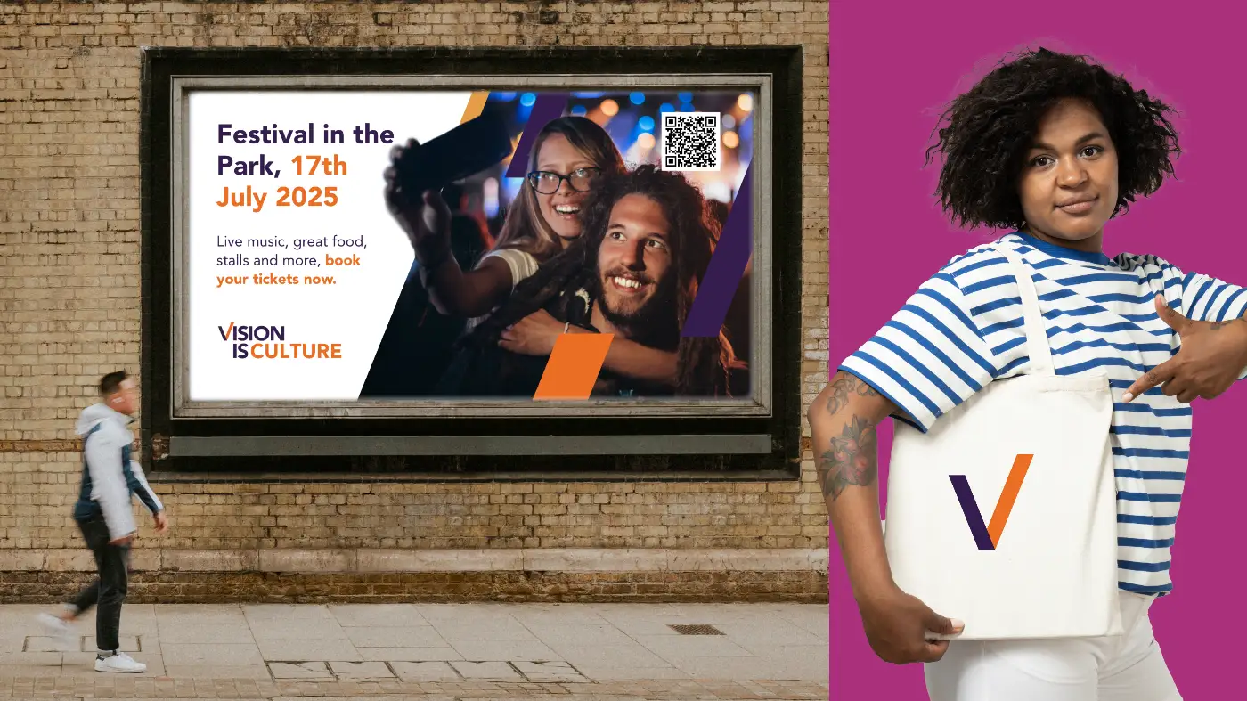
We then streamlined the existing brand architecture into seven distinct sub-brands. Each has its own identity while remaining clearly part of the wider Vision family. All sub-brand logos follow the same design principles as the main Vision RCL mark, incorporating the recognisable V symbol and a designated colour. This created a consistent, highly recognisable system across all services.

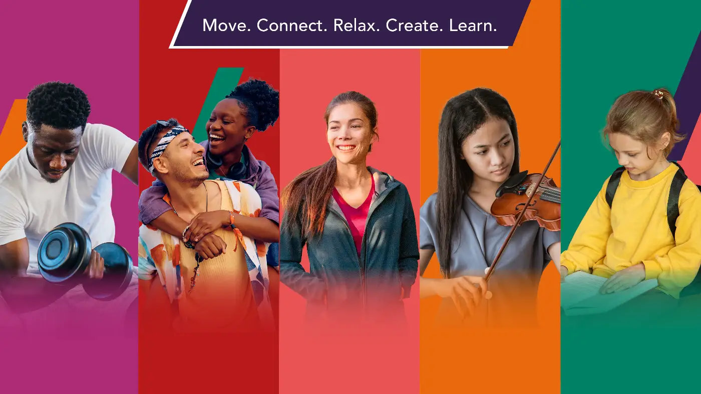
We defined the Five Pillars of Wellness, which articulate how Vision RCL supports wellbeing across everything it delivers. These are Movement, Connection, Mindfulness, Creativity and Learning.
To support internal teams, we set up Vision RCL’s Canva Brand Toolkit and created a flexible suite of templates. We also delivered a practical brand training session covering consistent brand application, use of Canva, font and colour usage, image selection, writing effective descriptions and calls to action, as well as overall brand positioning and quality control.
Digital and rollout
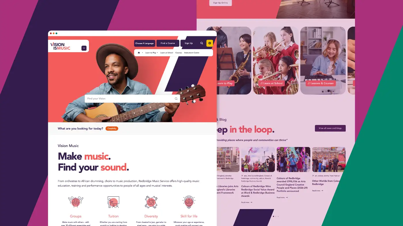
We designed and developed a new website to bring the brand to life online, supported by clear online brand guidelines that make it easy for teams and partners to apply the brand consistently and with confidence.
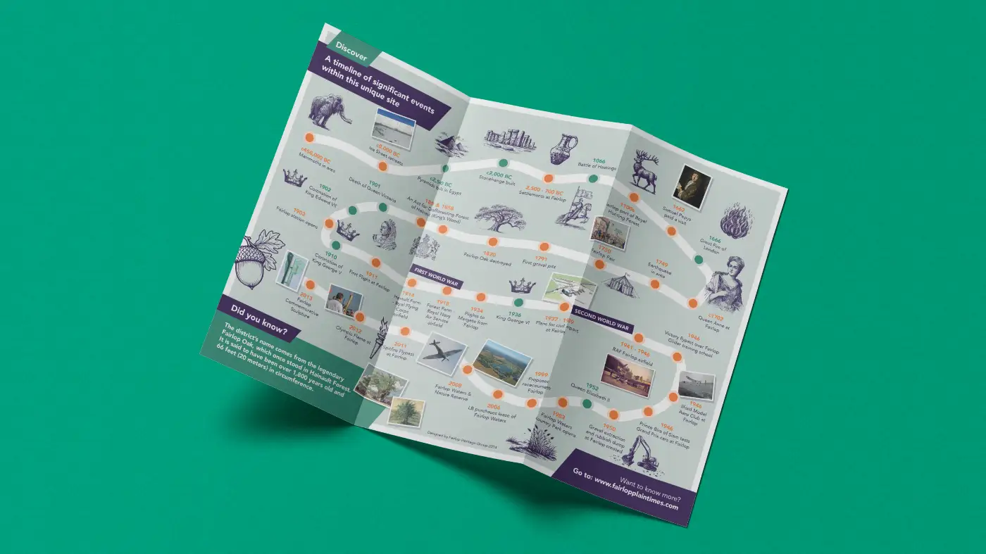
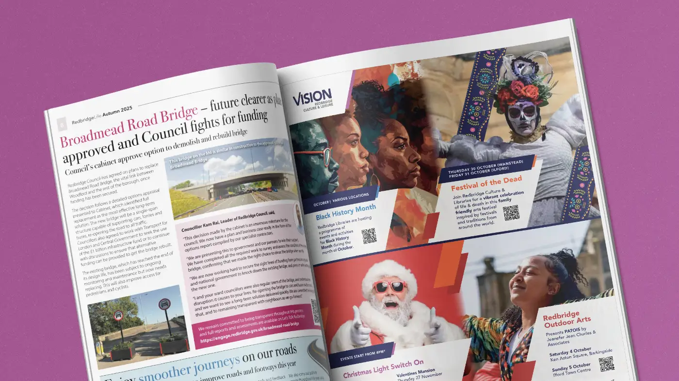
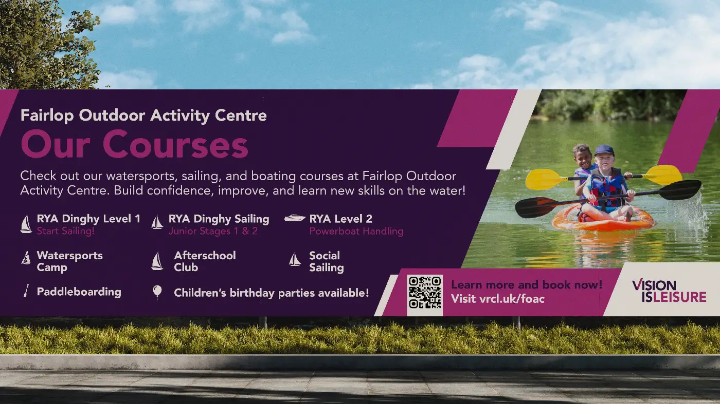
The brand was also rolled out across leaflets, price lists, signage, magazine advertising, posters and more, ensuring a cohesive experience at every touchpoint.