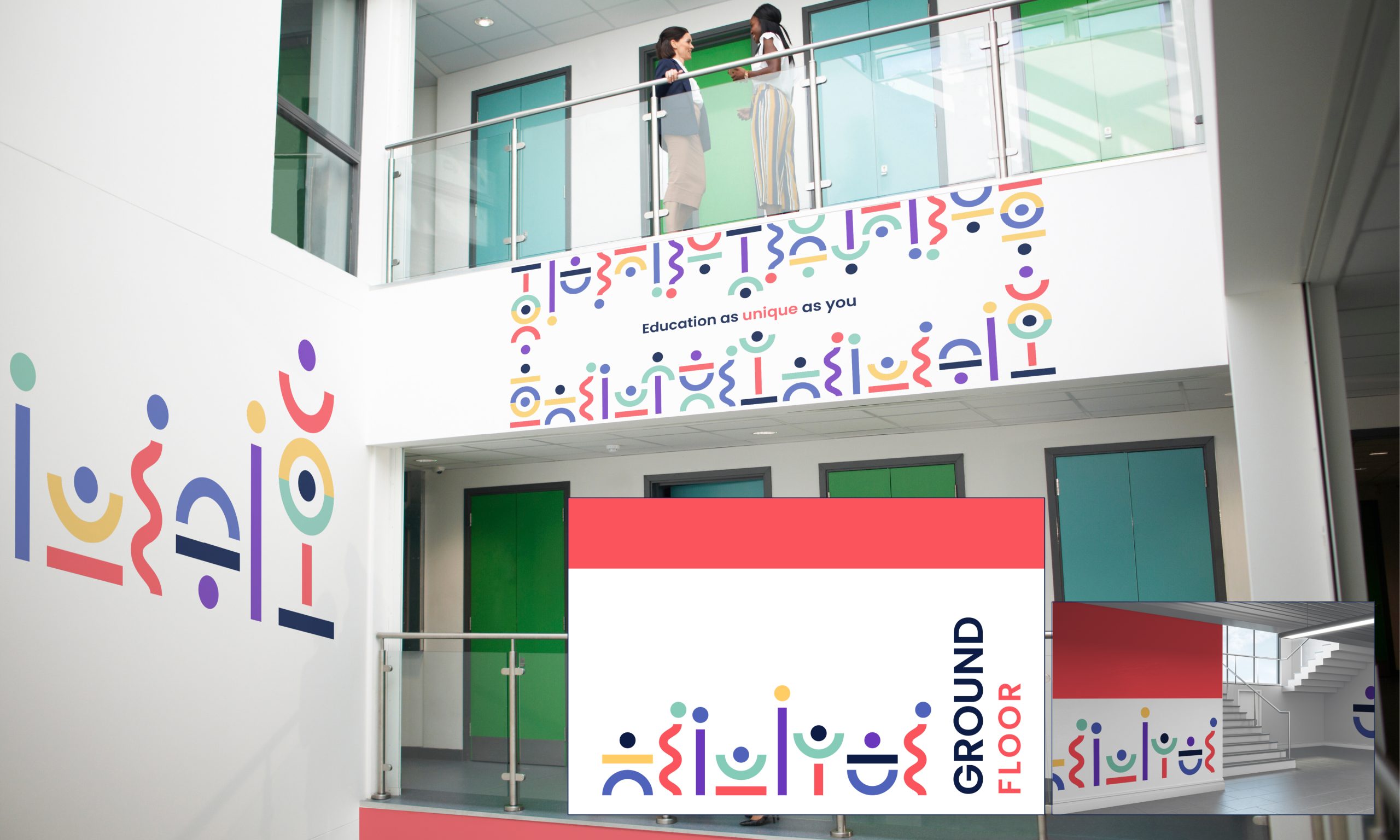

Crafting a New Identity for an Inclusive Future
St Christopher’s Trust, a charitable organisation overseeing primary schools across Devon, Plymouth, and Torbay, sought to redefine its identity to align with its refreshed mission, vision, and values. Their new mission emphasises collaboration to deliver high-quality, principled education to every pupil. The vision, “Learning to live full lives,” and their values—encompassing inclusion, collaboration, stewardship, respect, humility, and trust—required an identity that could encapsulate these ideals.





Our Approach
We began with an immersive brand workshop, diving deep into understanding the Trust’s ethos and the educational landscape in which it operates. This foundation allowed us to explore and analyse competitor identities, ensuring our direction was both distinct and resonant.
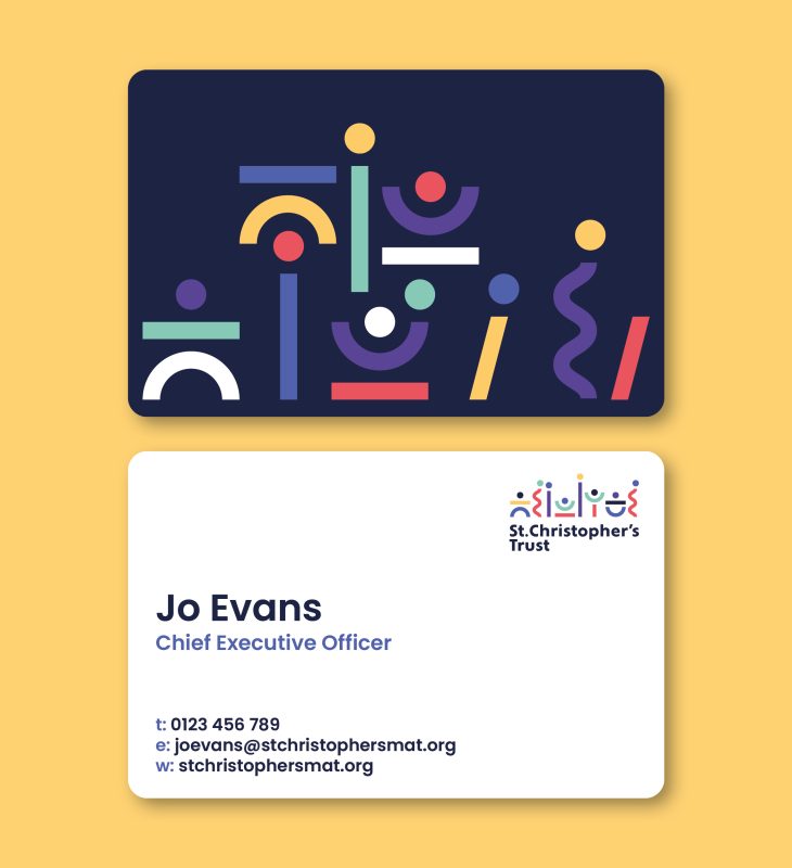
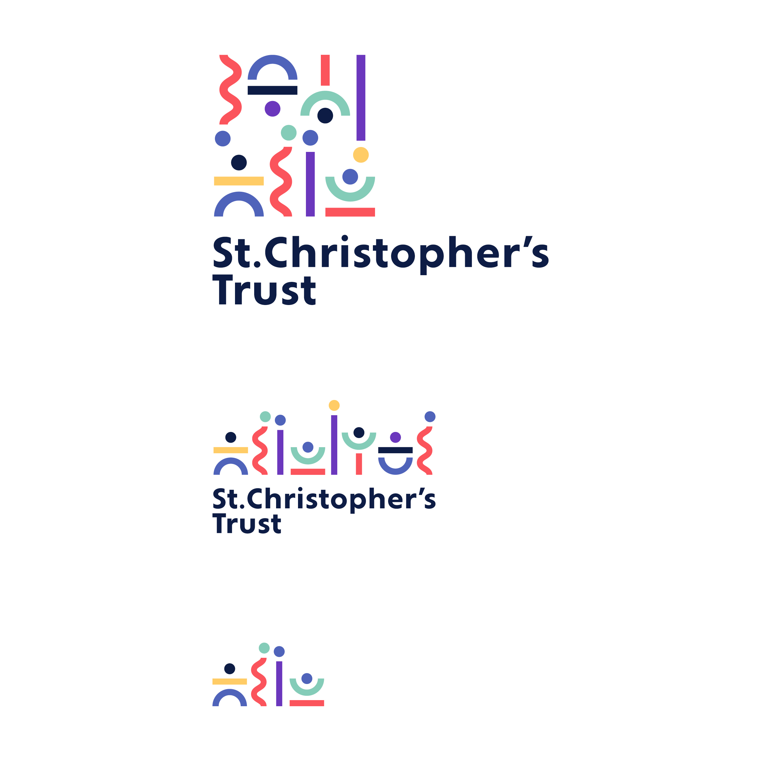
The identity we crafted is built upon the concept of diversity and inclusion, represented through a variety of shapes. Each shape symbolises the unique members and students that make up the St Christopher’s Trust community, reflecting the organisation’s commitment to embracing and celebrating differences. This approach is more than symbolic; it’s a visual representation of their inclusive philosophy.



A Flexible Palette
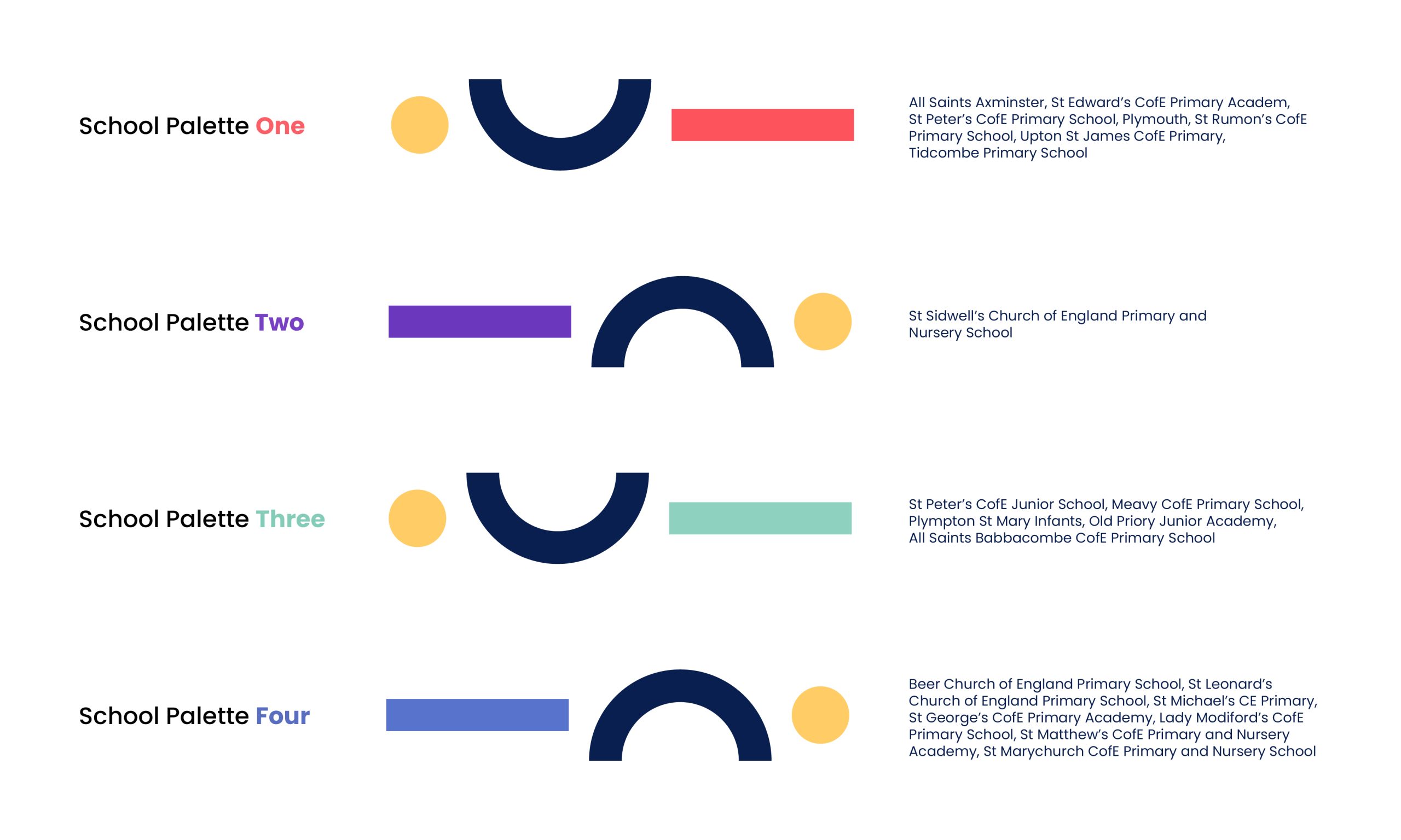
To cater to the diverse range of schools under the Trust’s umbrella, we developed a flexible colour palette. This palette is vibrant, engaging, and modern, yet sufficiently sophisticated to appeal to all stakeholders. By assigning different colour combinations to materials for each school, we maintained a cohesive brand identity while allowing individual schools to retain their distinctiveness.

A Dynamic Logo and Badge of Pride
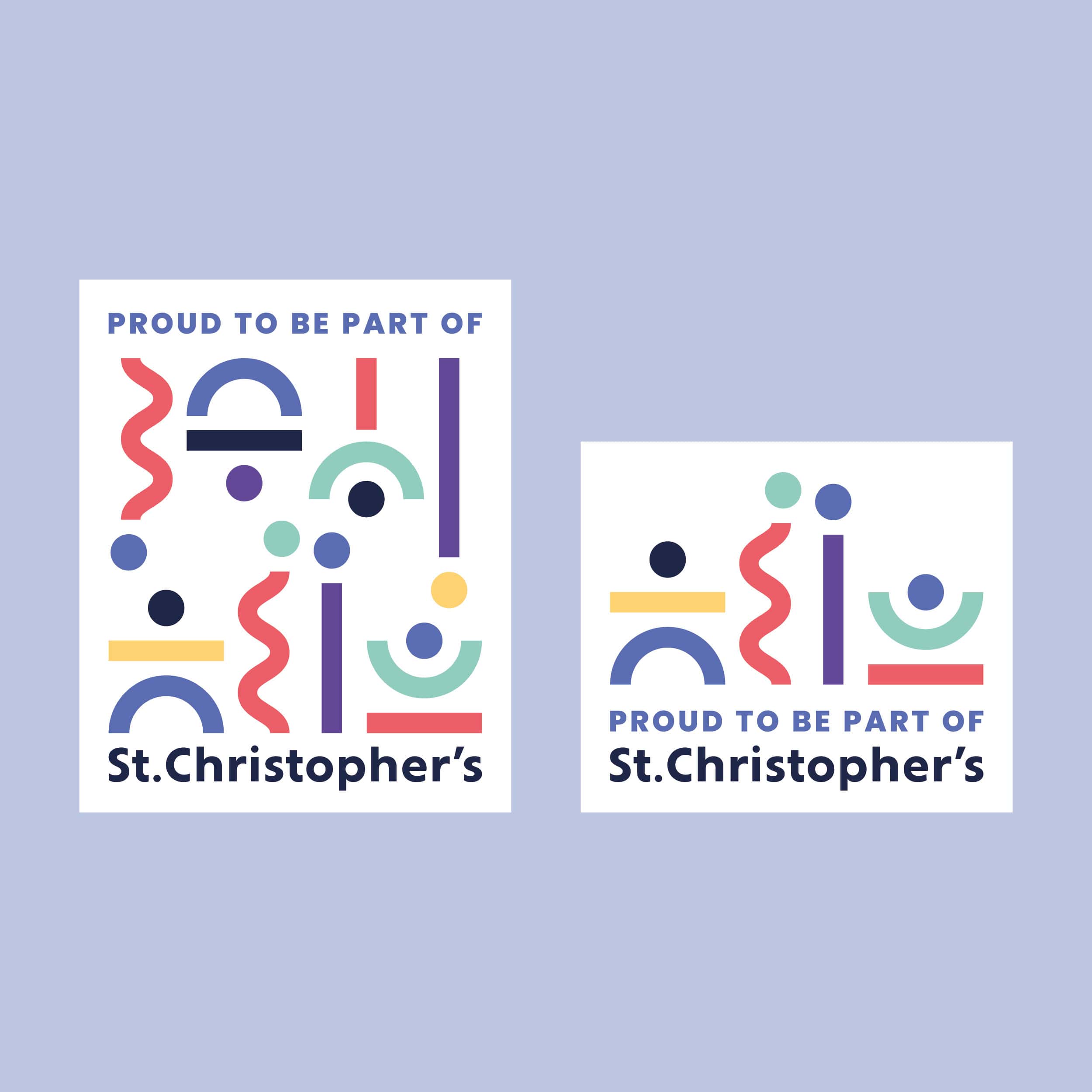
Central to the new identity is a dynamic logo that adapts to its context. This logo, rooted in the same shapes and forms that represent the Trust’s inclusivity, can be modified in configuration depending on where it is used, ensuring it is always relevant and impactful. Alongside this, we designed a “Proud to be part of St Christopher’s” badge, which schools can prominently feature on their materials. This badge reinforces a sense of unity and belonging across the Trust, while allowing individual schools to proudly align themselves with St Christopher’s values and vision.


The Result
The identity is anchored by a carefully considered hierarchy of strong colours and distinctive, legible fonts. This ensures that all communications are consistently branded, even in the absence of a traditional logo. The design language is extended through playful illustrations, constructed from the same shapes and blocks of colour. These illustrations reflect St Christopher’s friendly, approachable nature and their commitment to fostering a personal, human connection in everything they do.
In essence, the new identity not only encapsulates the Trust’s refreshed mission, vision, and values but also serves as a dynamic and inclusive visual language that resonates with every member of the St Christopher’s community.
