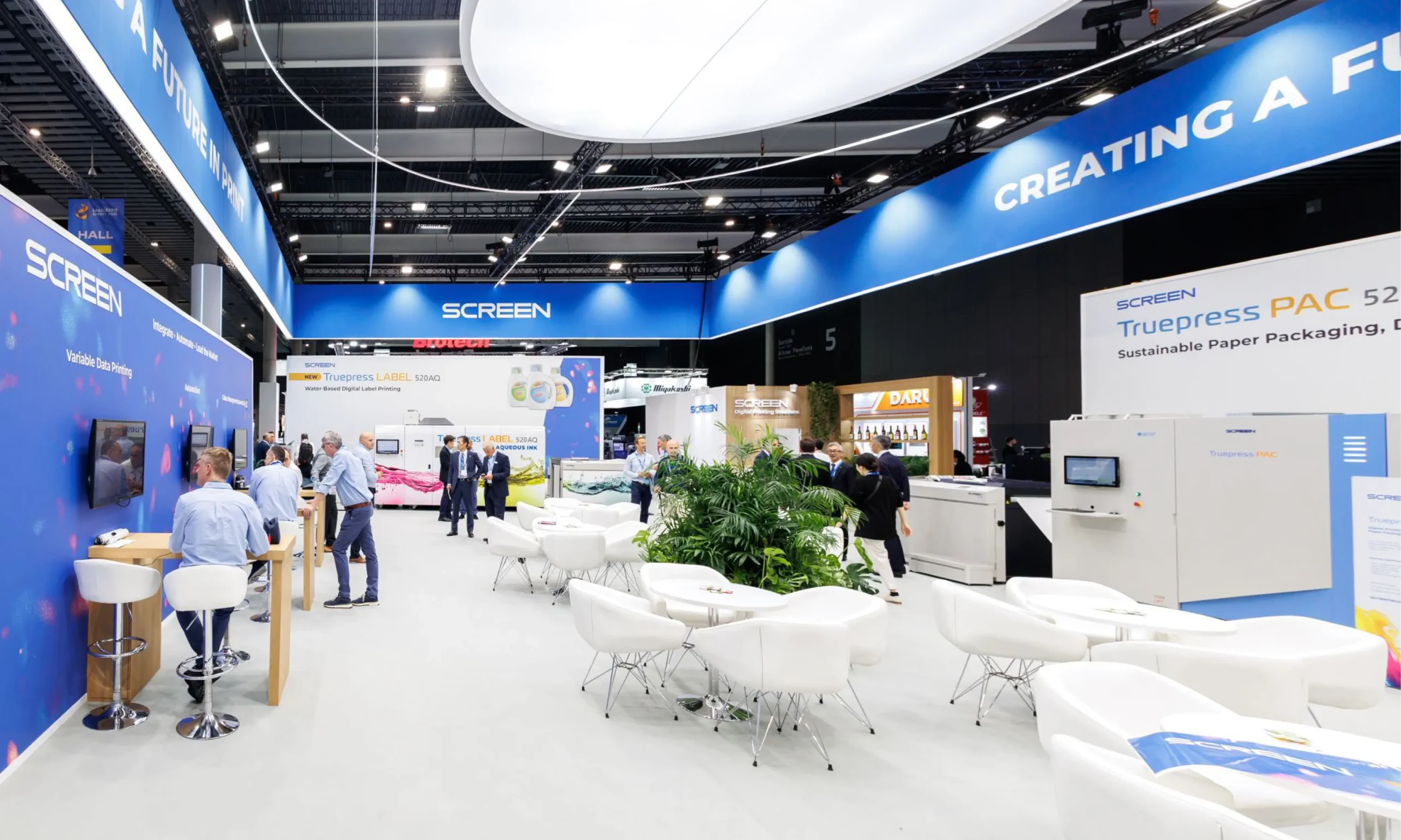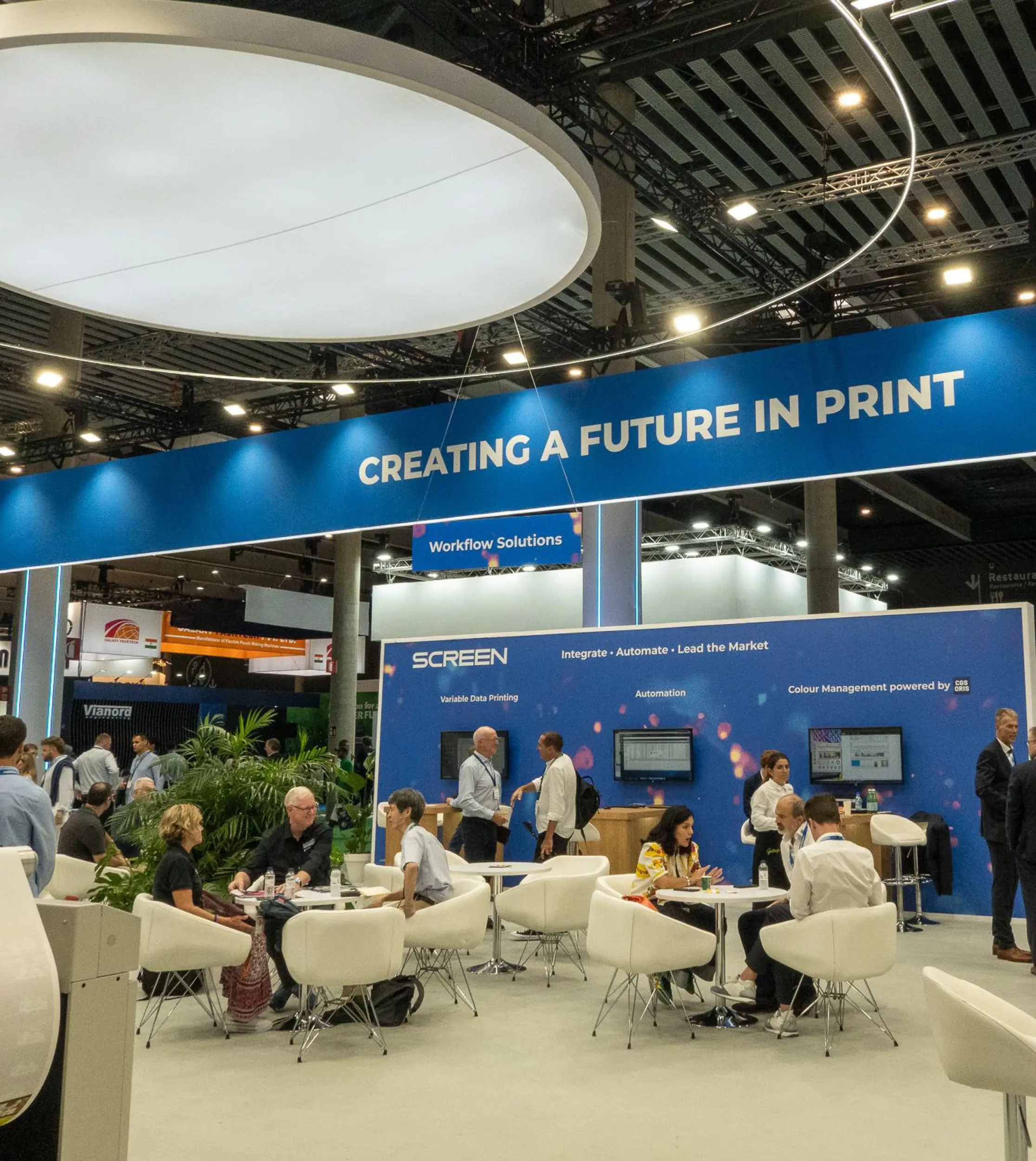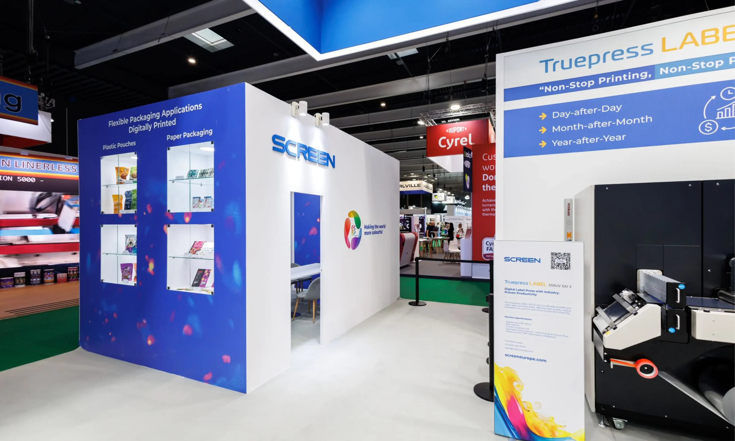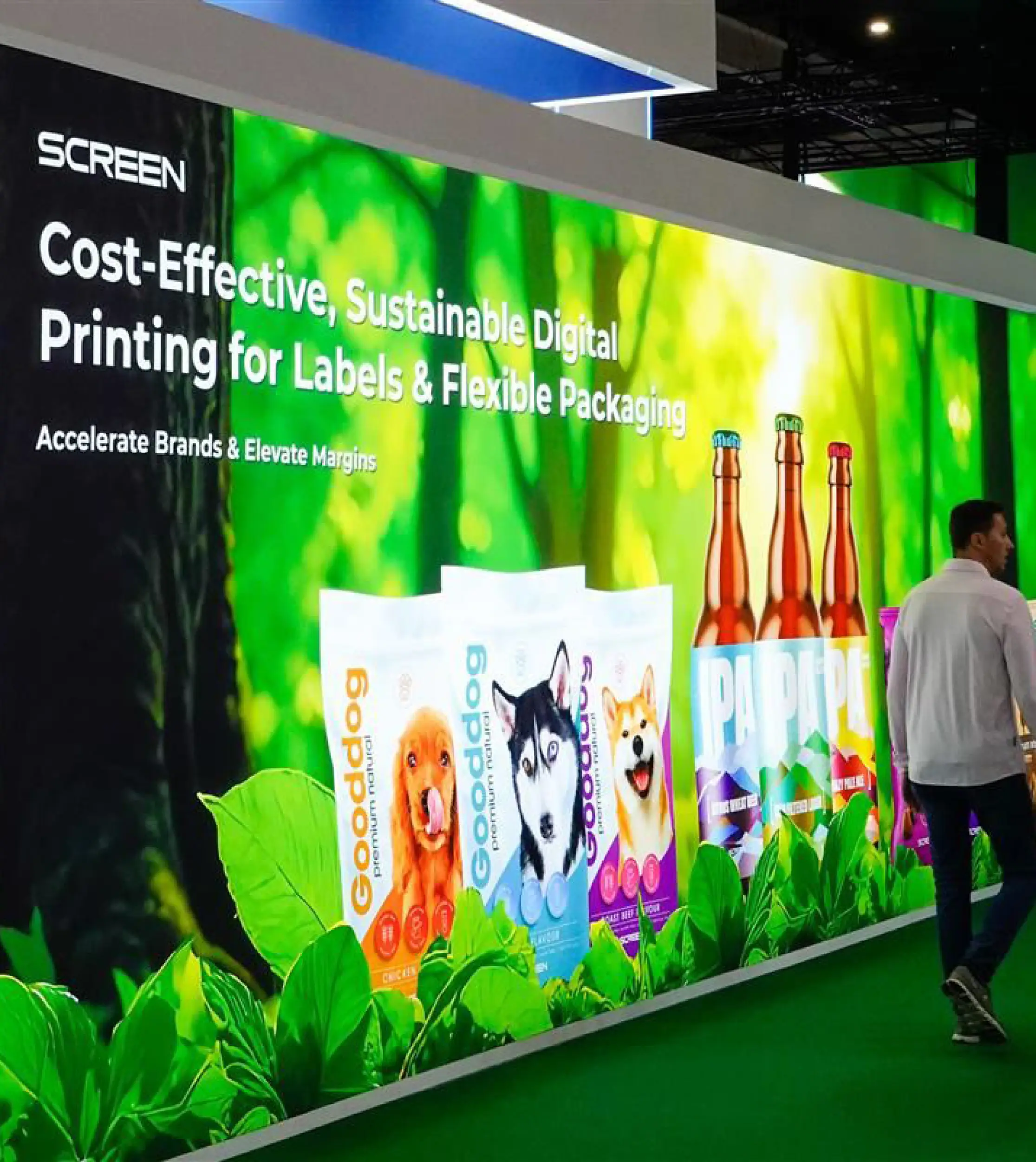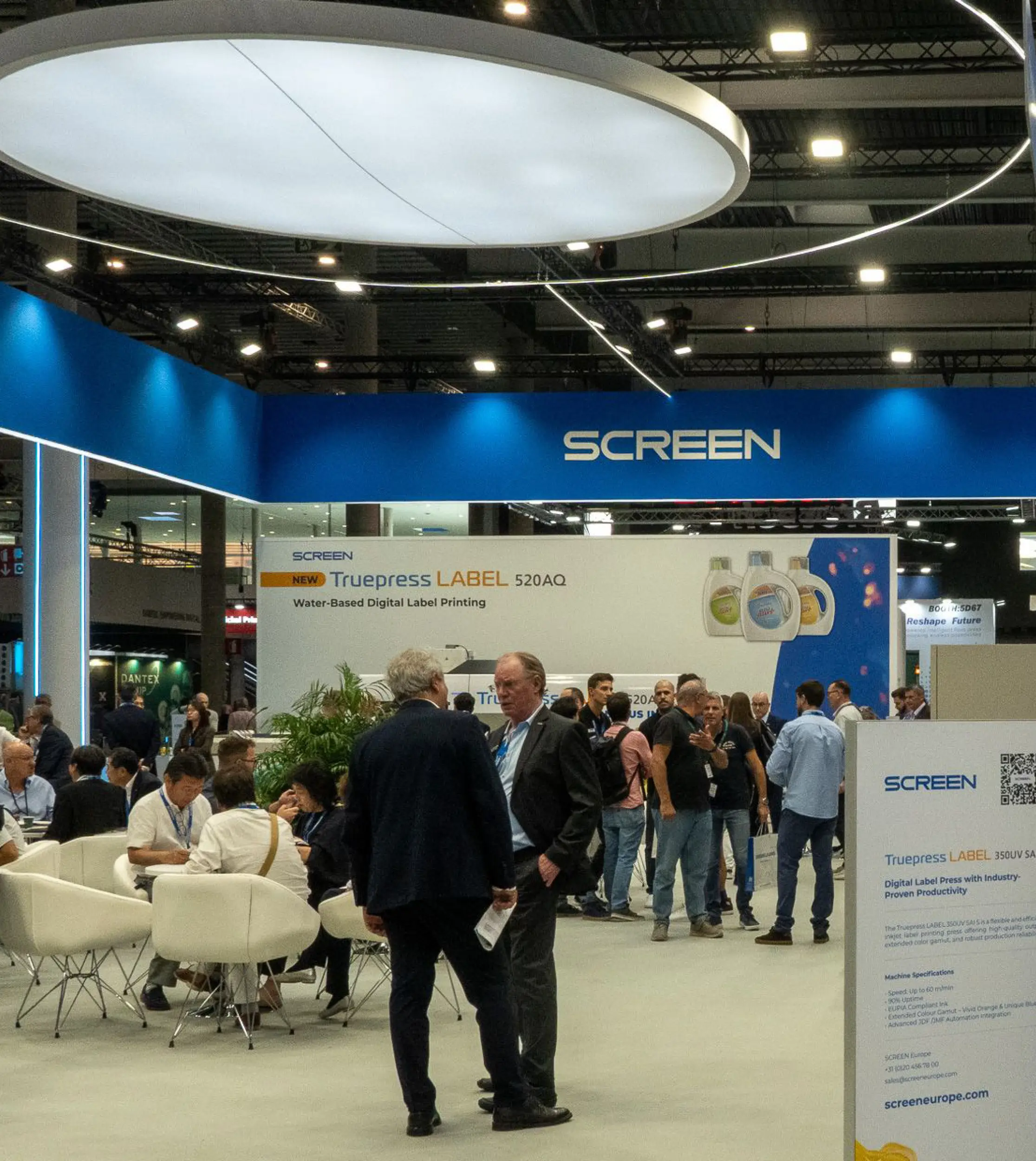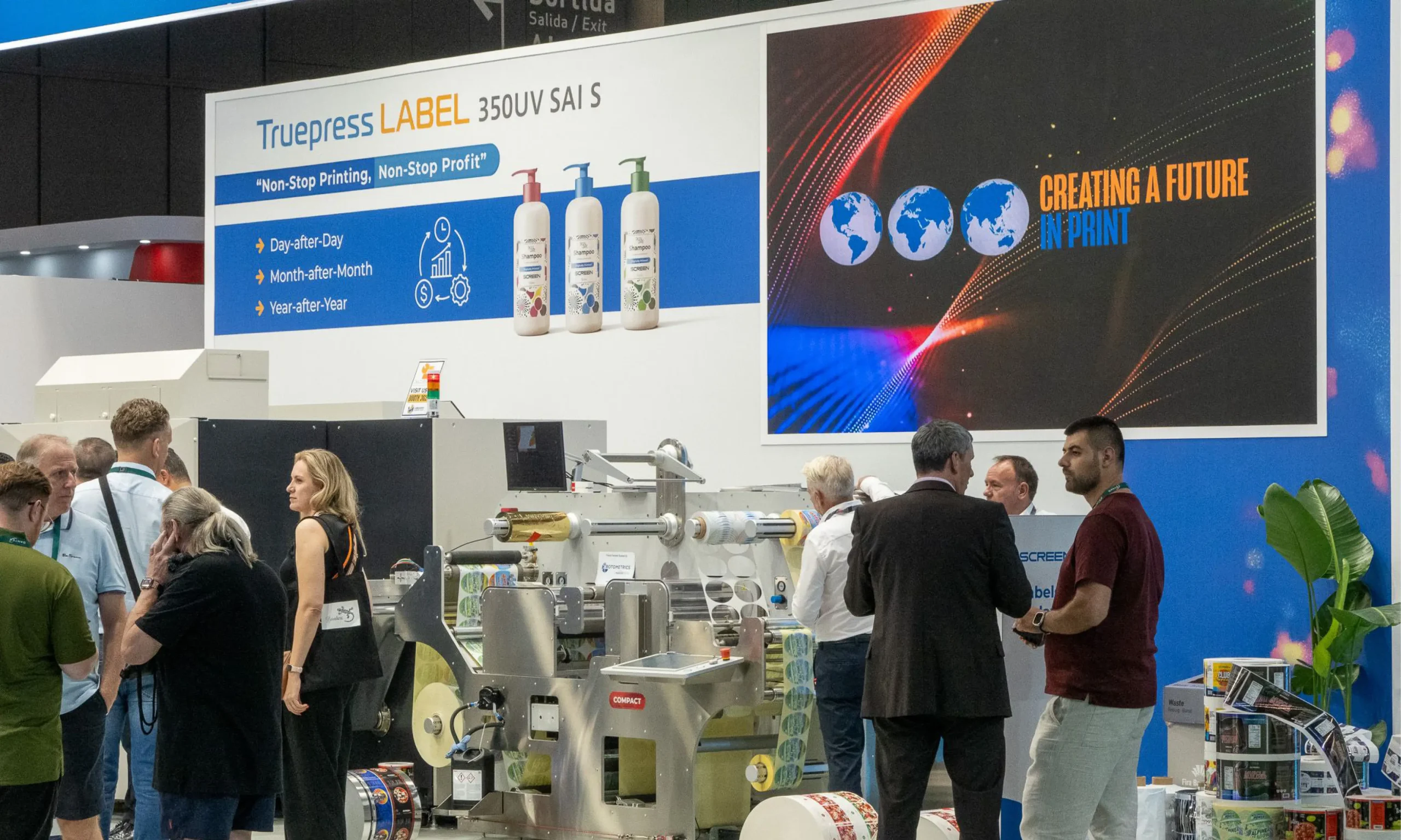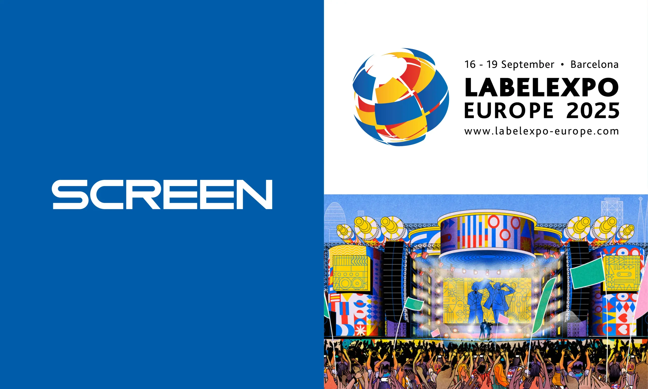

Partnering with SCREEN Europe
SCREEN Europe partnered with Bigwave Marketing to design the graphics for their 500sqm exhibition stand at LabelExpo 2025. The project required creating a cohesive visual identity across a range of stand areas, including hospitality zones, meeting rooms and a striking reception space with large-format backlit displays. Working closely with multiple stakeholders, the team delivered a polished, premium look that elevated the brand and created an impactful visitor experience.

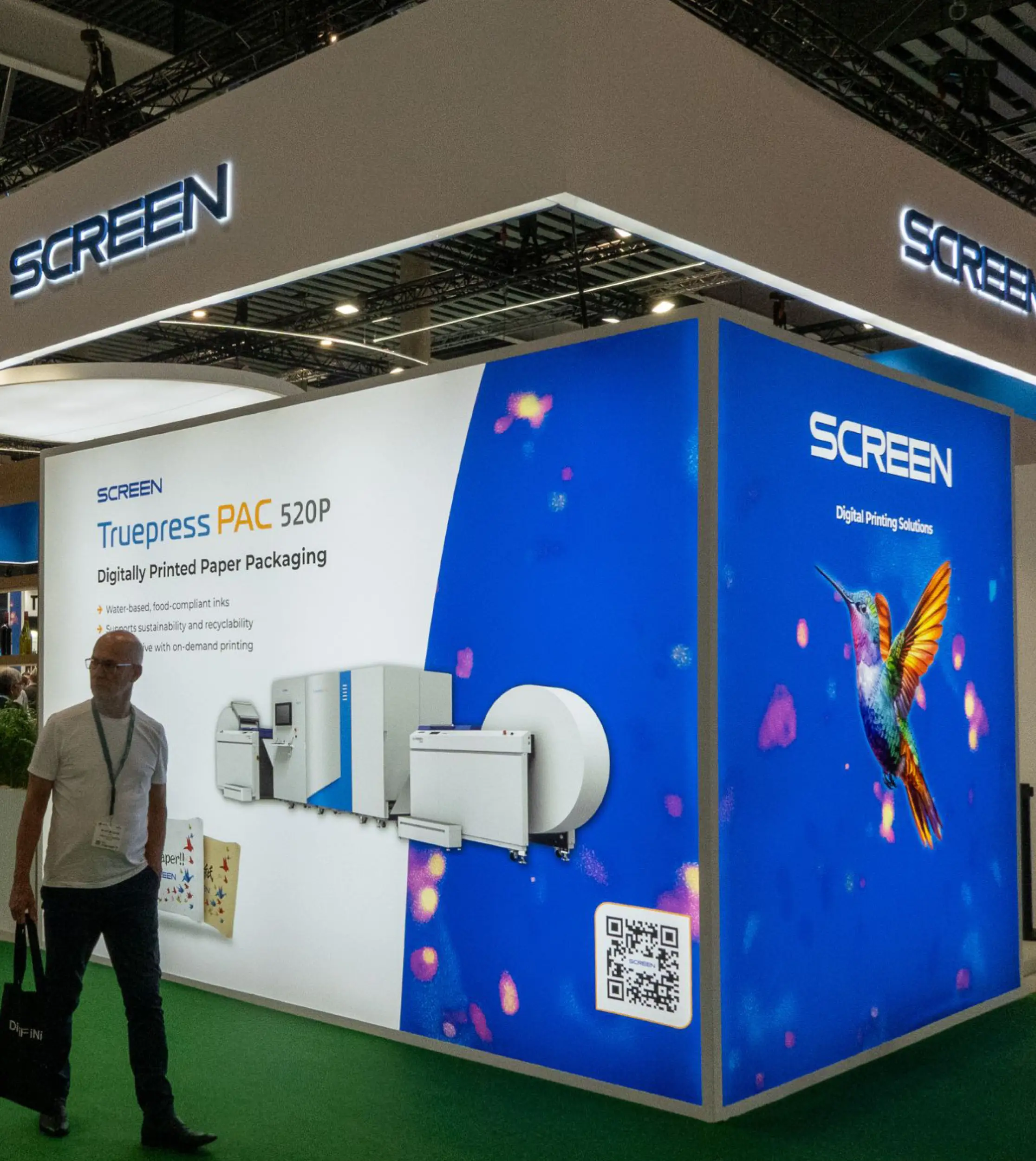
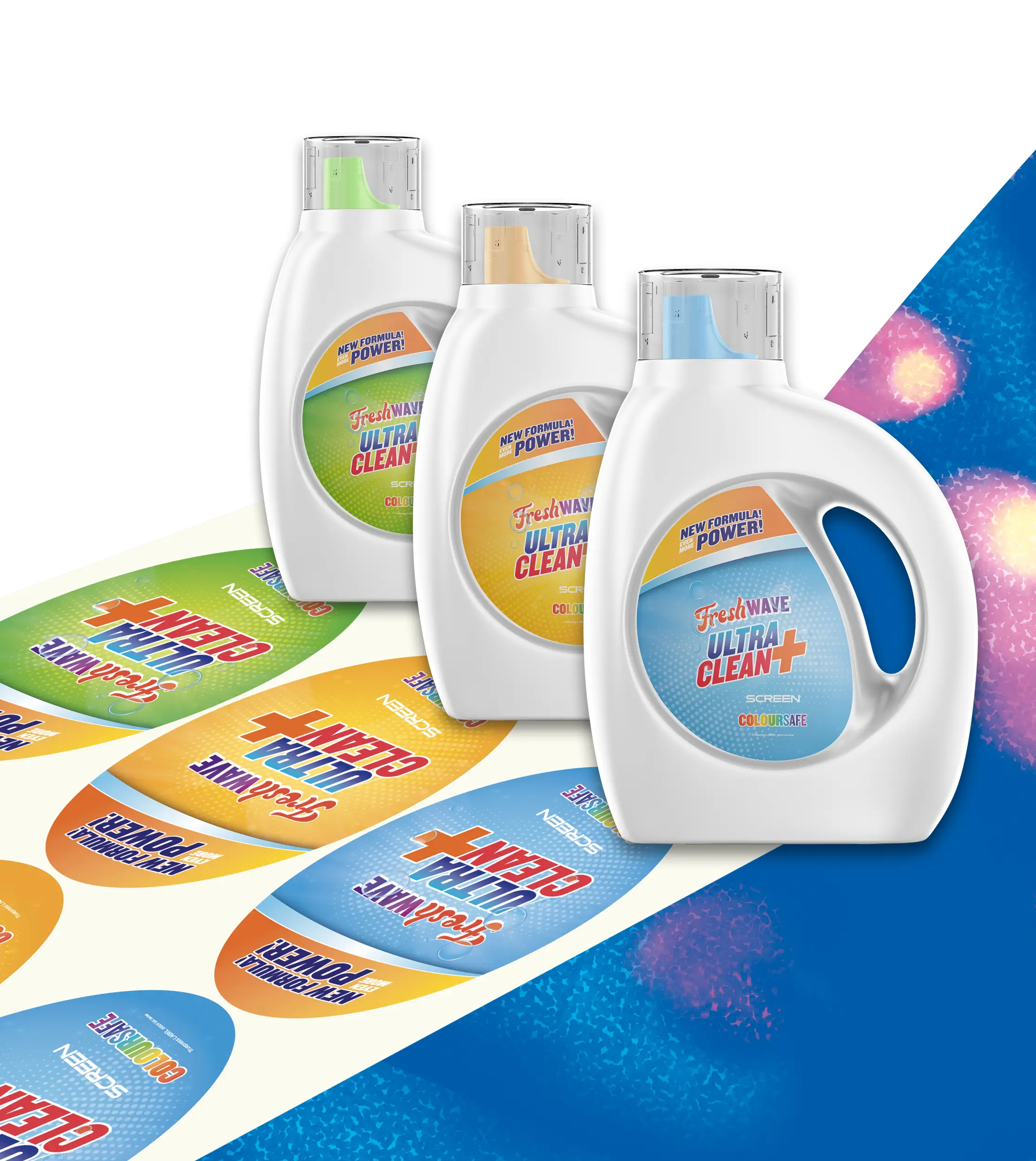
Creating An Iconic Image
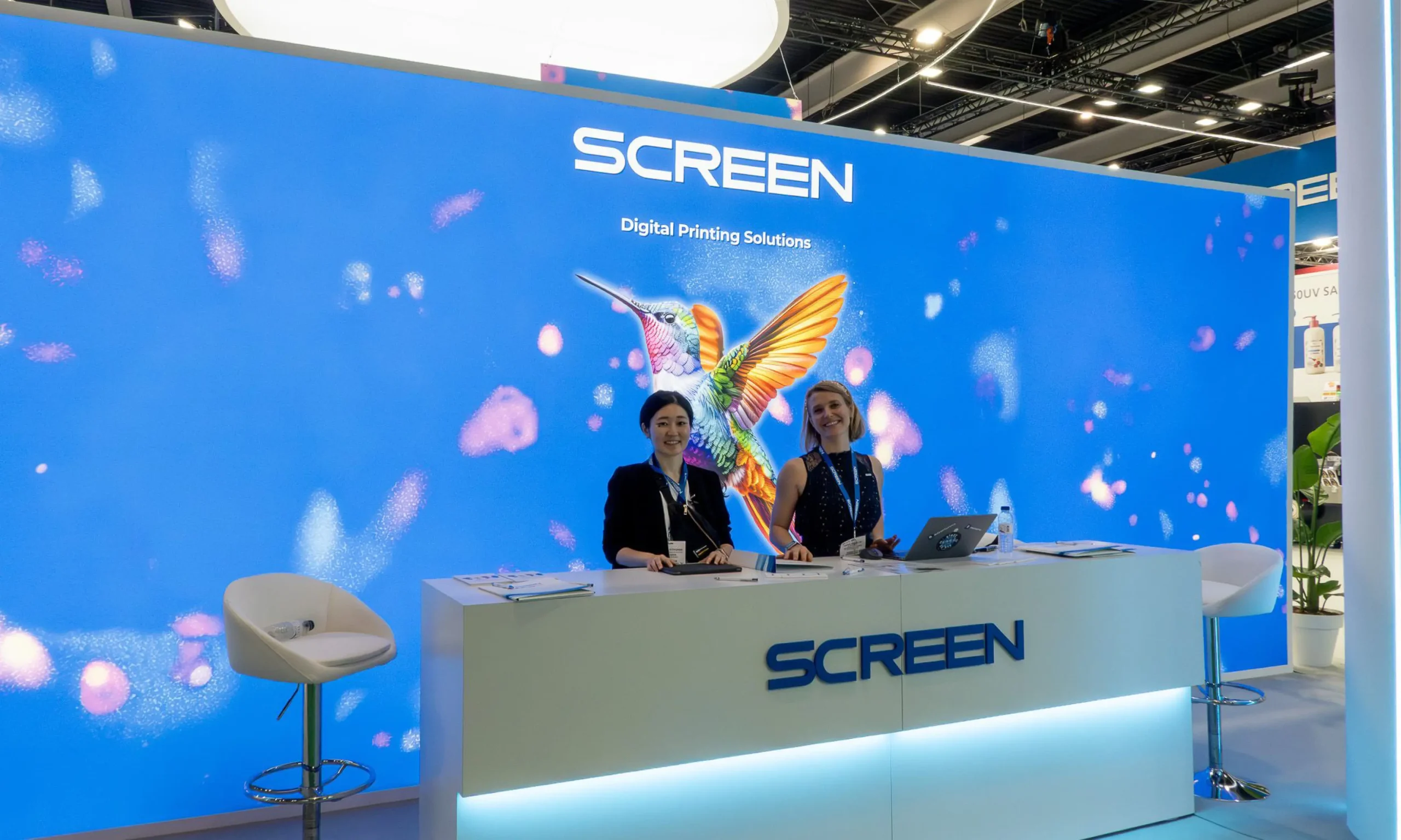
To support SCREEN’s ambition to create an ‘Iconic Image’ that could be used across both their exhibition stand and wider campaign assets, we developed a vibrant and meticulously detailed illustration of a hummingbird. Chosen for its natural elegance and precision, the hummingbird reflects the accuracy and high‑quality performance associated with SCREEN’s technology. Its bright, impactful design translated beautifully when reproduced at scale for the stand graphics, while also providing a memorable and cohesive visual that strengthens the brand’s presence across all marketing materials.
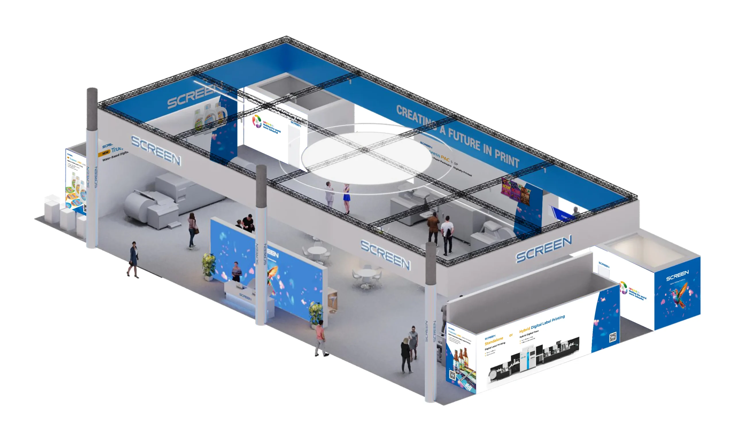
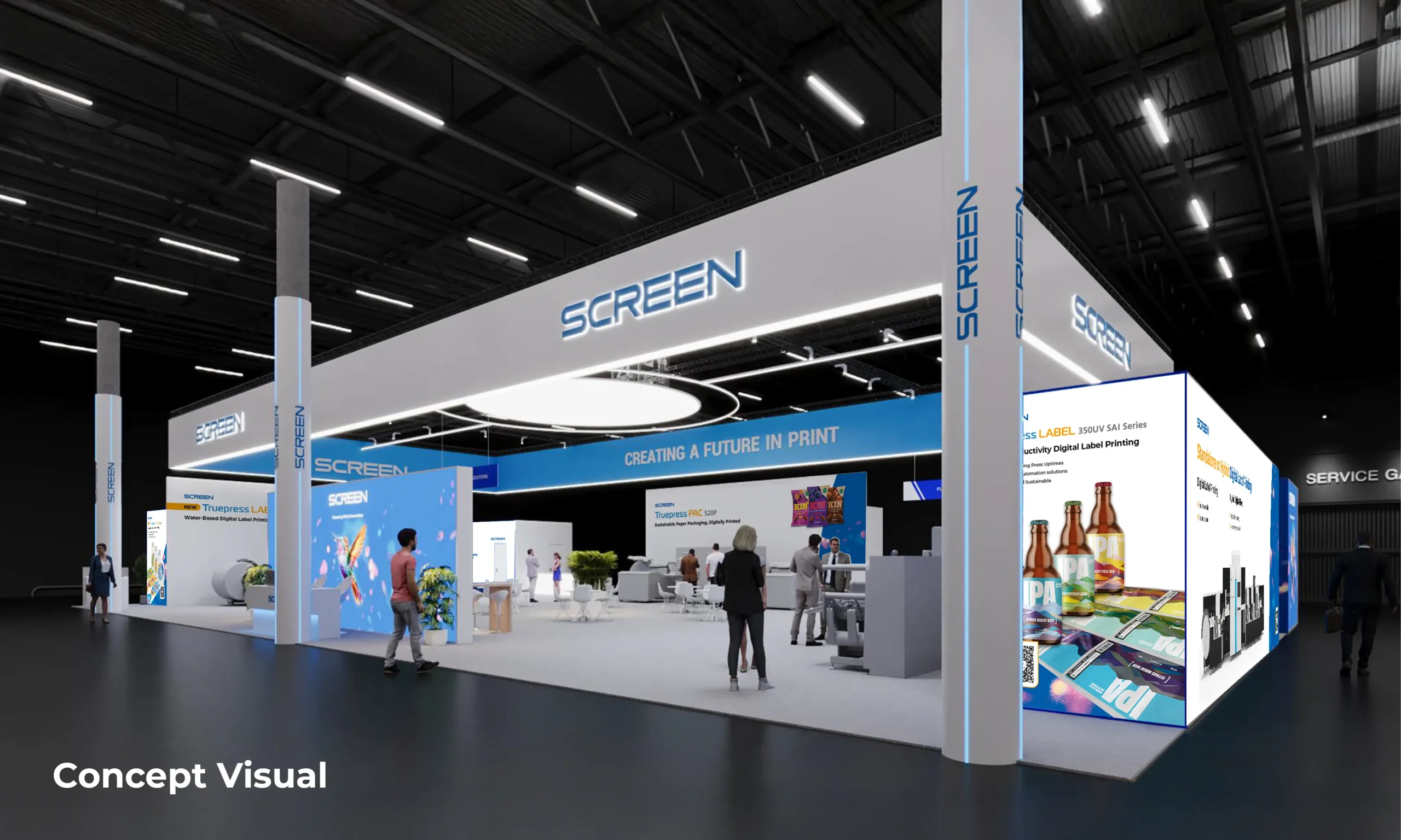
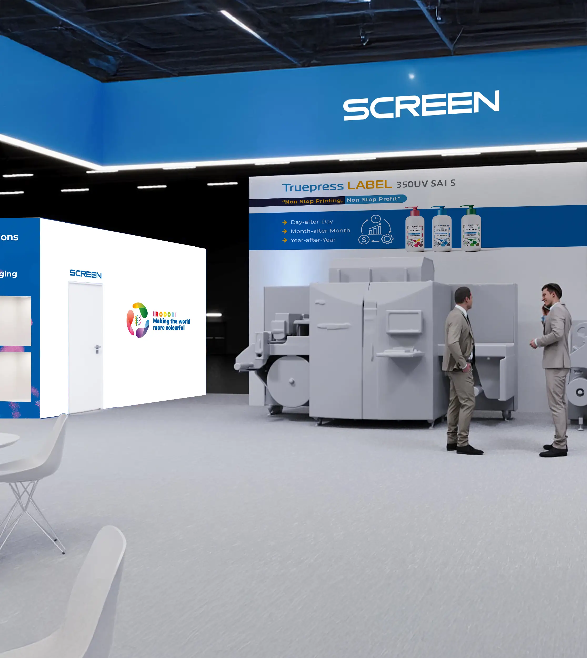
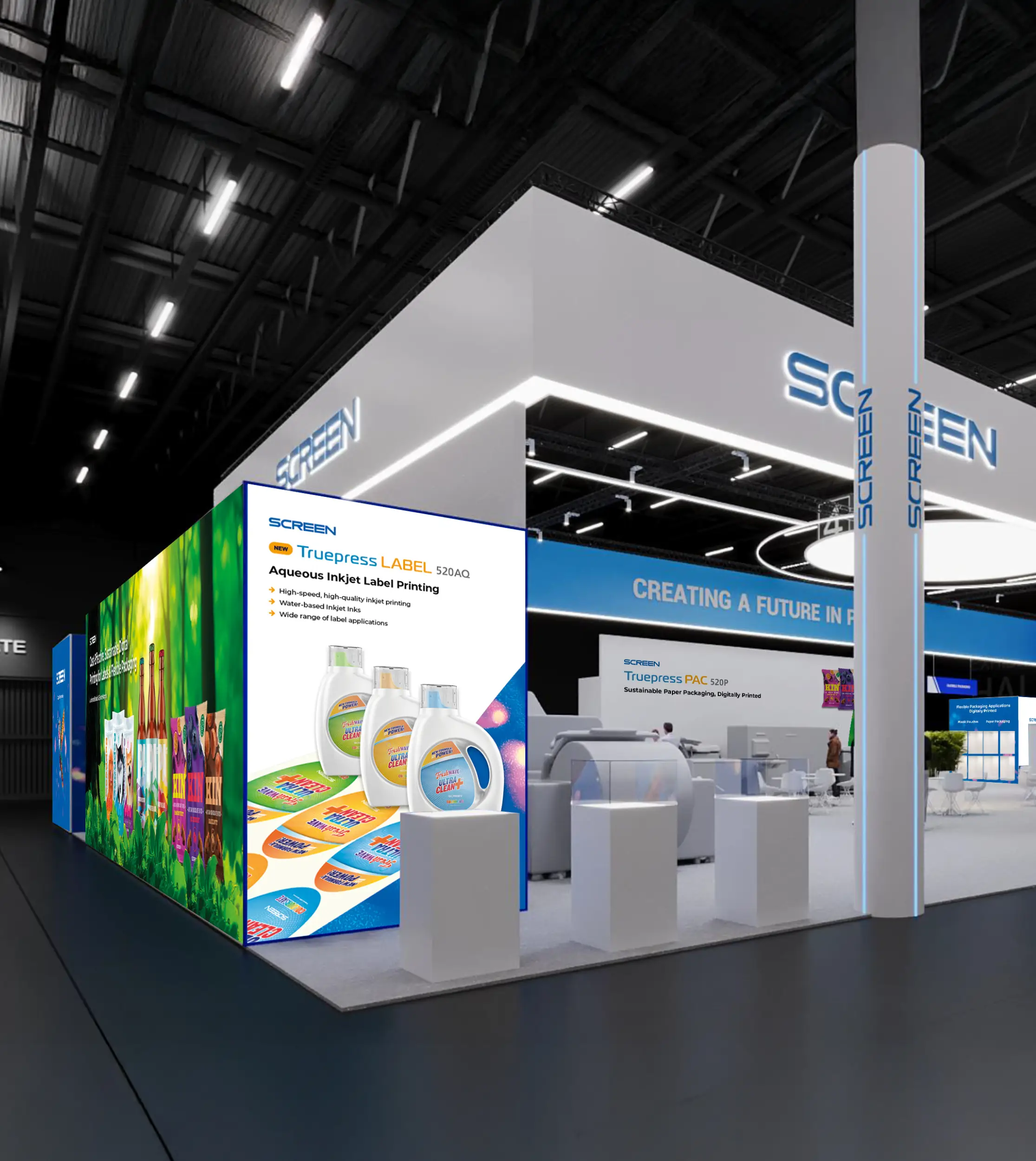
Visualising The Stand In 3D
To help SCREEN clearly visualise how the stand graphics would appear in the final space, we overlaid the design concepts onto detailed 3D visuals provided by their stand-building partner. This approach allowed us to present highly realistic representations of how the artwork, signage and key stand features would work together at scale. By integrating our graphics into the existing renderings, the client was able to review the design in context and make informed decisions with confidence before production began.
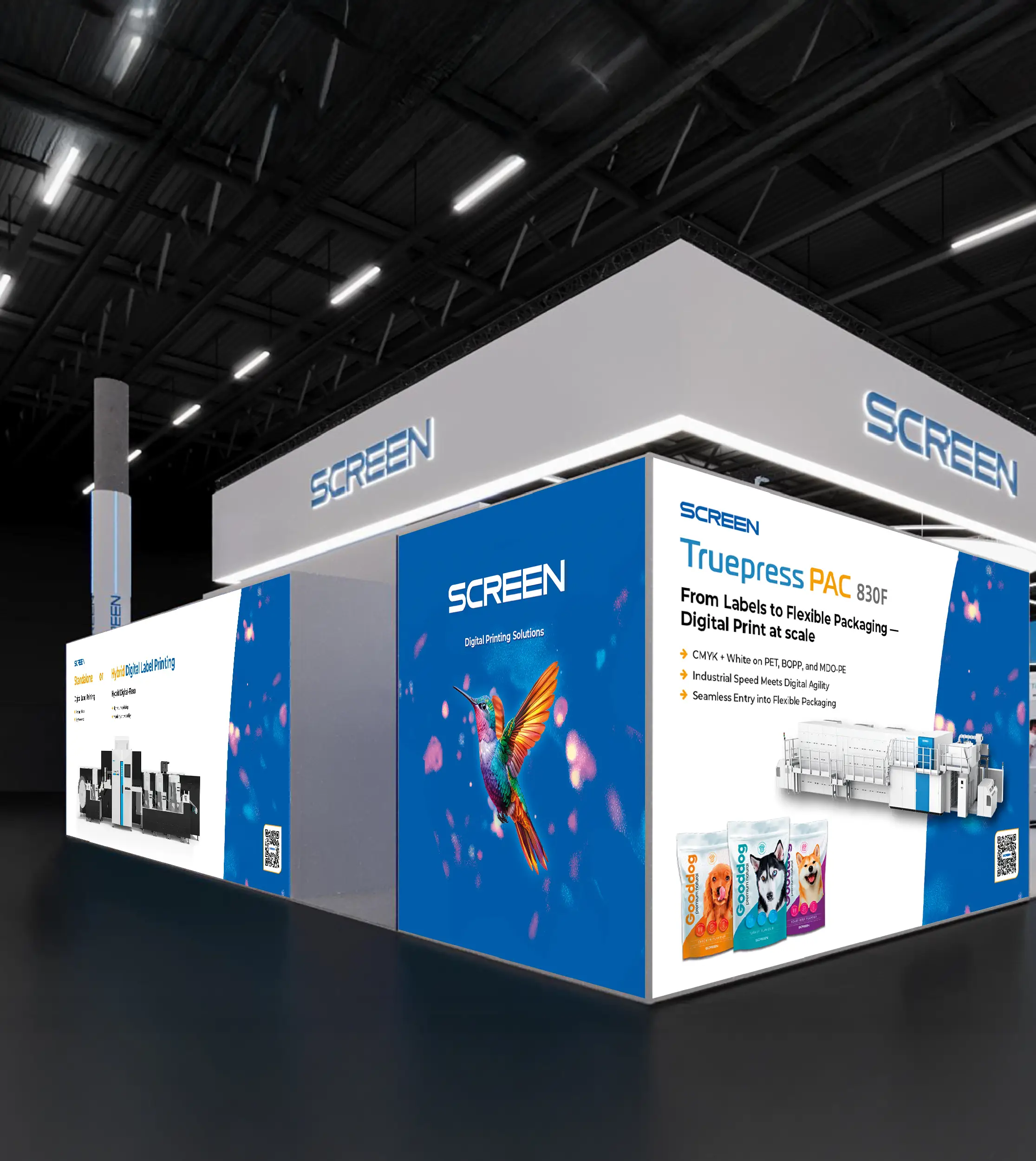
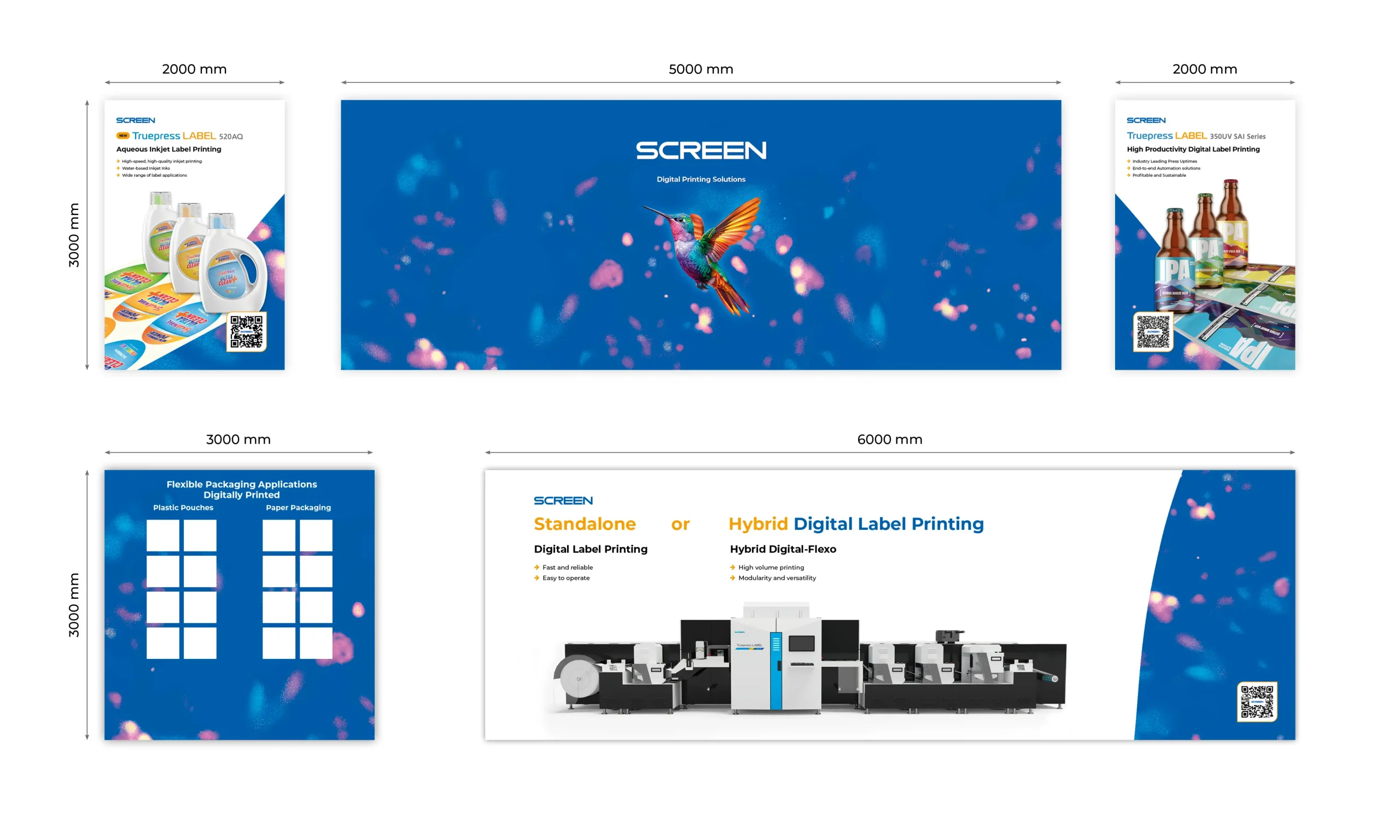
Creating Print Ready Artwork
To help SCREEN clearly visualise how the stand graphics would appear in the final space, we overlaid the design concepts onto detailed 3D visuals provided by their stand-building partner. This approach allowed us to present highly realistic representations of how the artwork, signage and key stand features would work together at scale. By integrating our graphics into the existing renderings, the client was able to review the design in context and make informed decisions with confidence before production began.
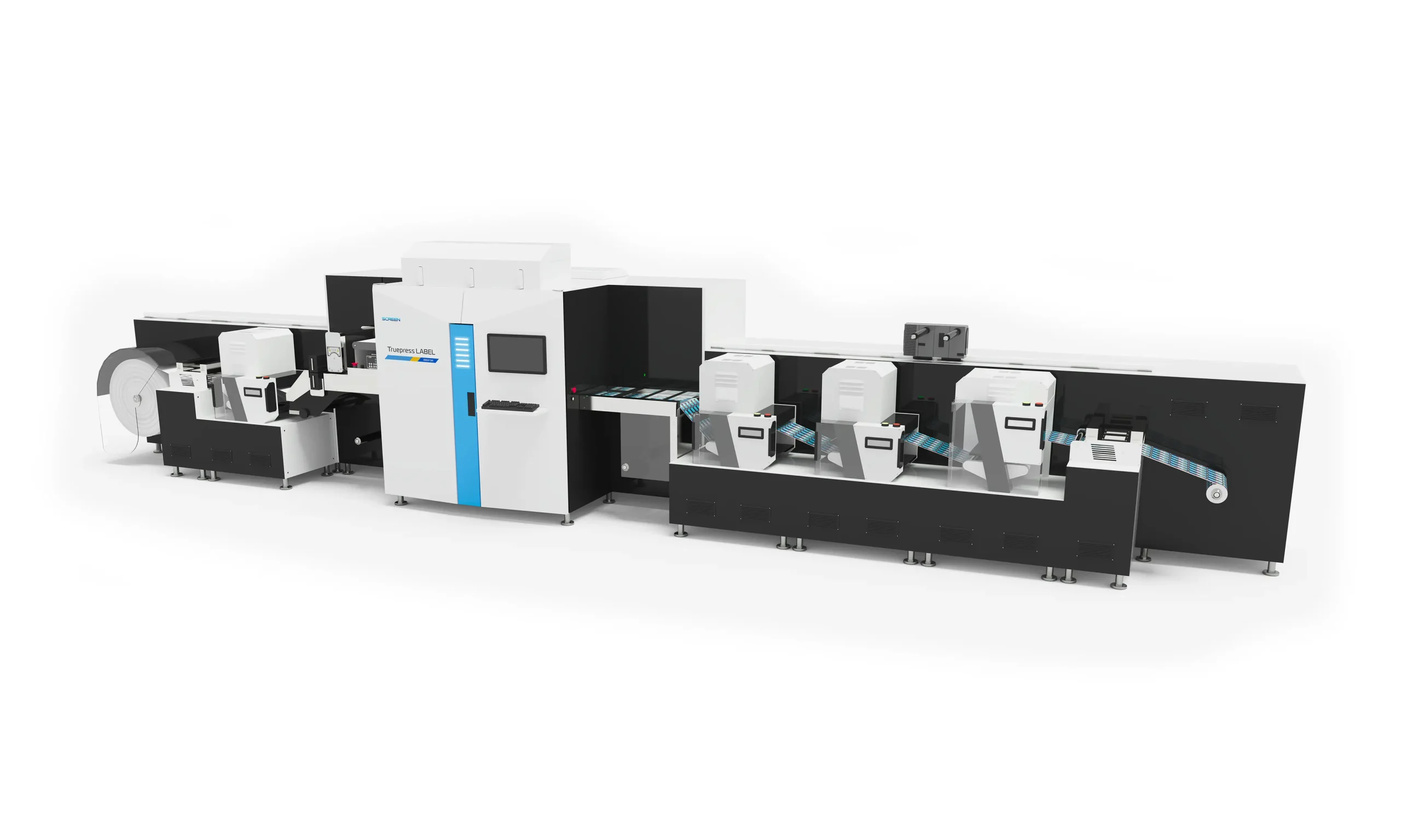
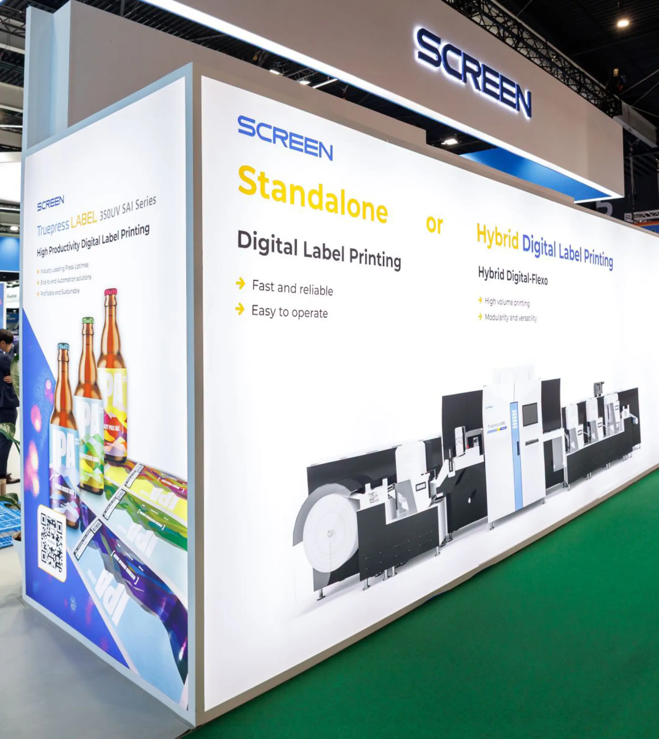
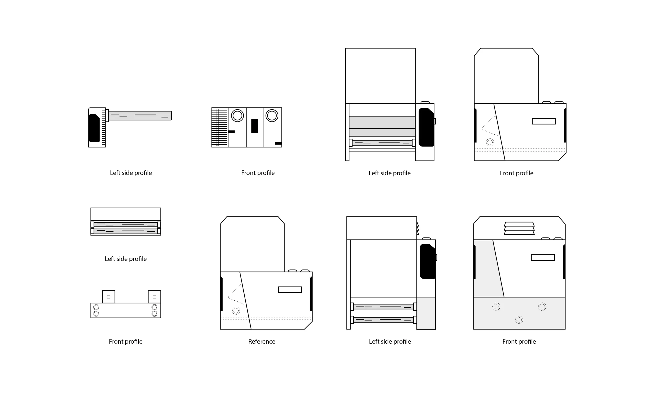
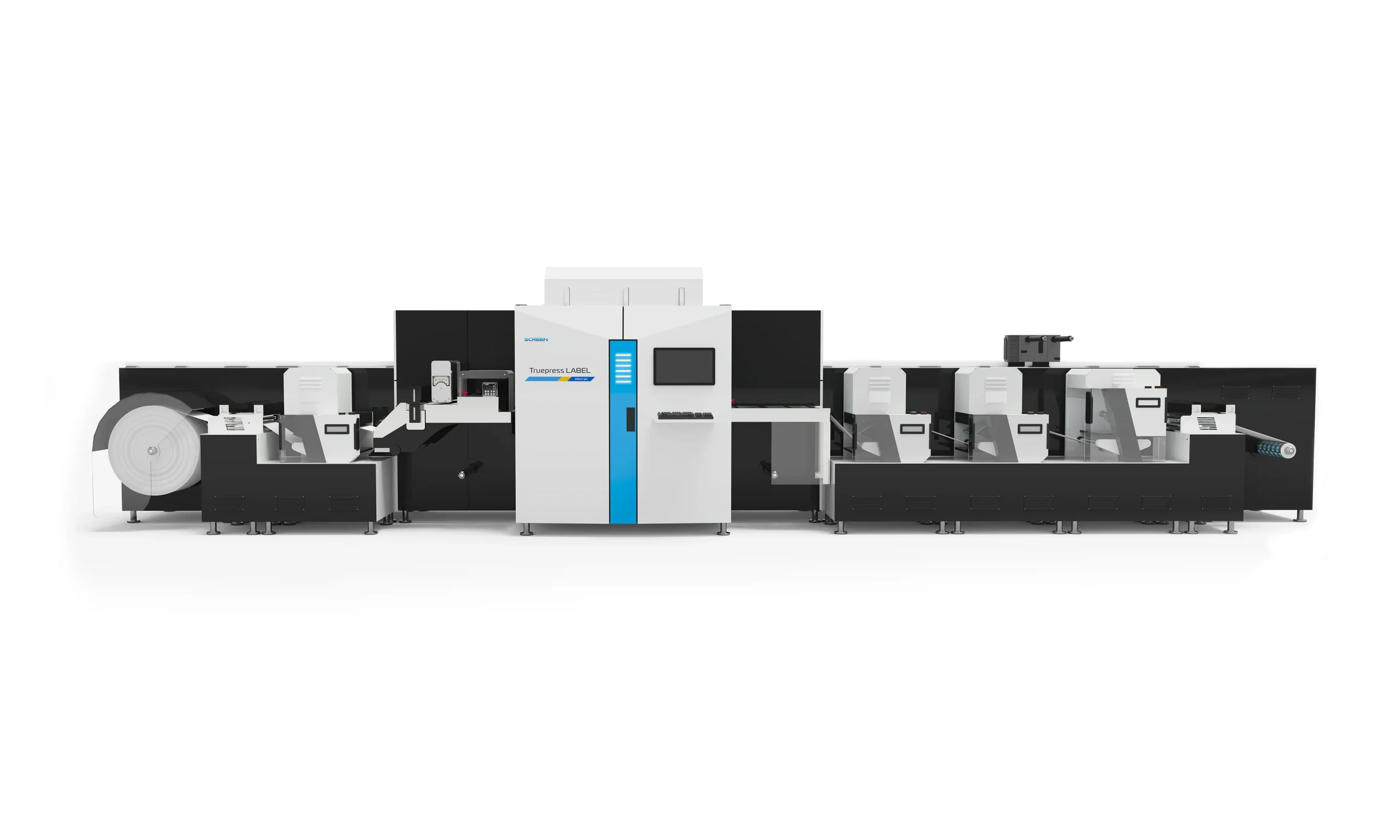
Hybrid Machine Creation
To showcase the capabilities of the Truepress LABEL 350UV SAI, we produced ultra‑high‑resolution renders of a hybrid configuration. As the press can be expanded with various modules, we created a tailored setup that demonstrates how it can adapt to different production needs. The final visual provided a technically accurate representation suitable for large‑format printing. A key challenge was ensuring none of the modules were in the style of actual manufacturers, as this would show bias. Therefore we created visuals that customers would instantly recognise as genuine modules, despite being fake.
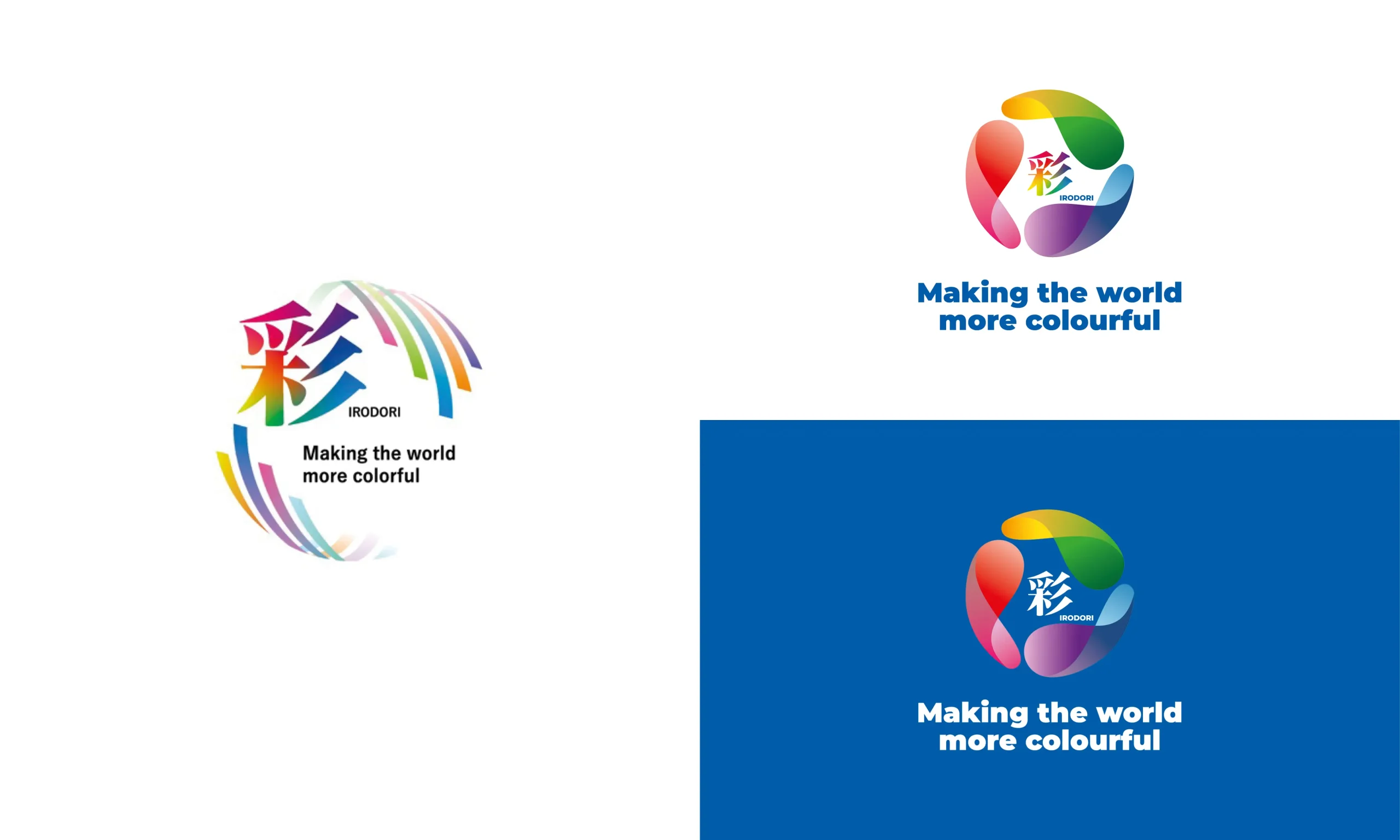
Irodori Logo Redesign
SCREEN Japan provided an existing logo used within their marketing, centred around the word Irodori, which translates to “making something more beautiful and vivid with colour.” We were tasked with adapting this for SCREEN Europe, with the goal of aligning with Western design expectations and ensuring it worked seamlessly across modern applications. We created a version that felt contemporary, versatile and more consistent with SCREEN’s evolving visual style, while still respecting the integrity and meaning of the original design and maintaining the Japanese Hiragana symbol.
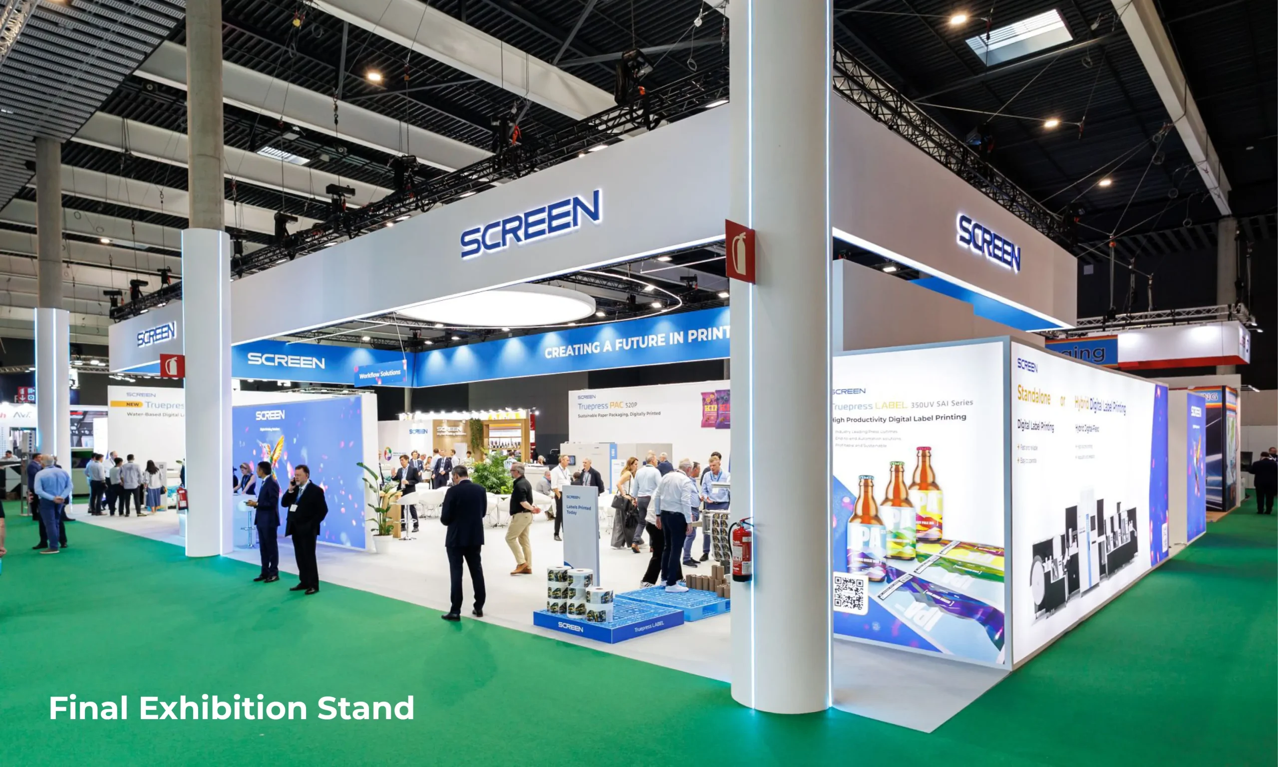
Final Result
To help SCREEN clearly visualise how the stand graphics would appear in the final space, we overlaid the design concepts onto detailed 3D visuals provided by their stand-building partner. This approach allowed us to present highly realistic representations of how the artwork, signage and key stand features would work together at scale. By integrating our graphics into the existing renderings, the client was able to review the design in context and make informed decisions with confidence before production began.