
Creating a Fresh Identity for a Leisure Centre Café
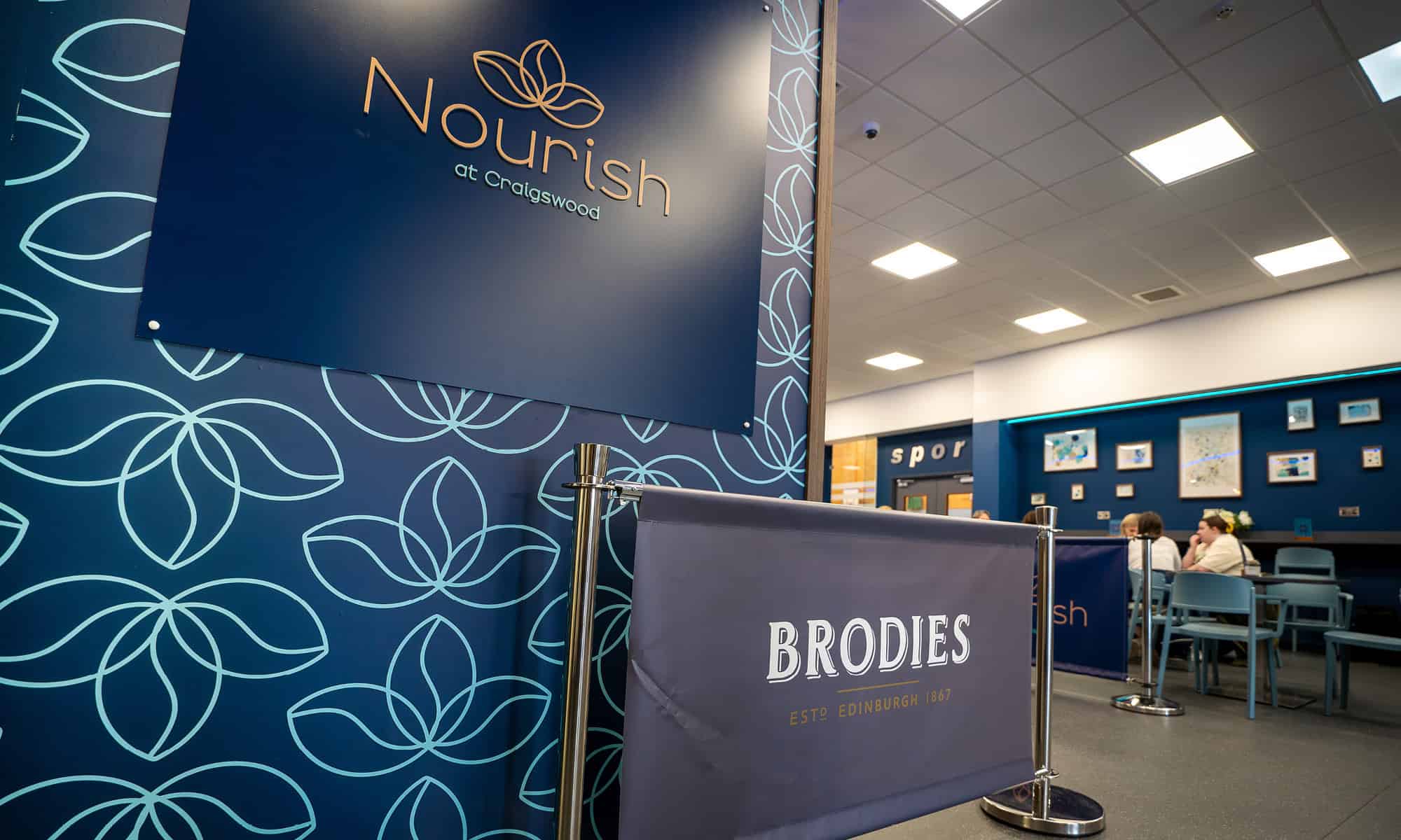
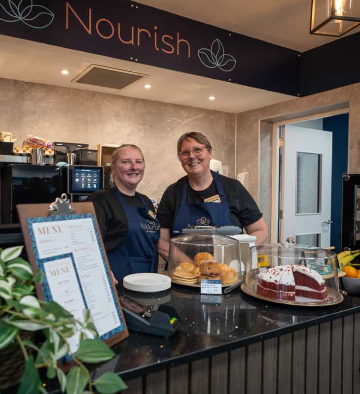
Nourish Café, located within the Xcite Craigswood Leisure Centre, sought a vibrant and welcoming brand identity that aligned with its goal of promoting health and wellbeing. The café aimed to stand out in a lively setting while encouraging healthy living and supporting the overall ethos of the leisure centre.
The Logo
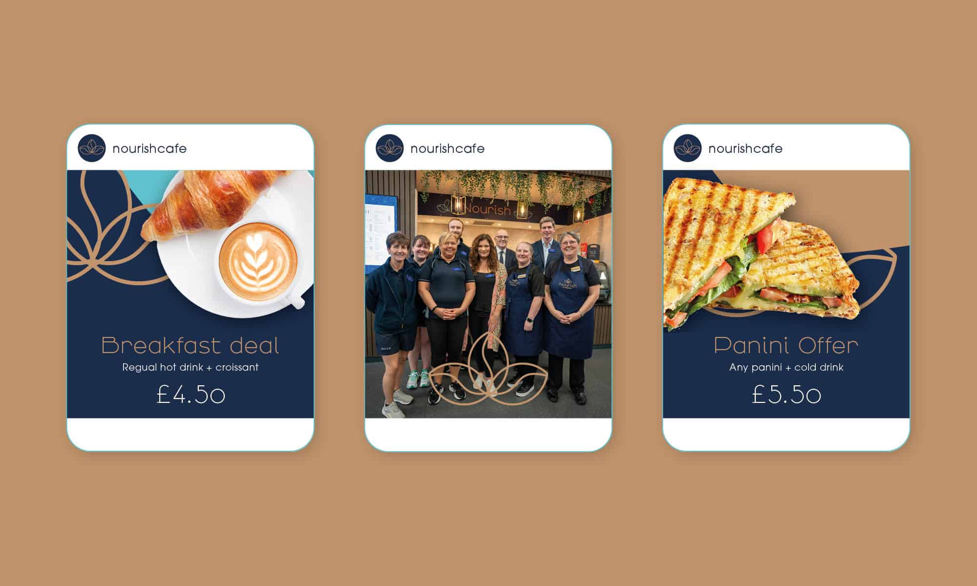
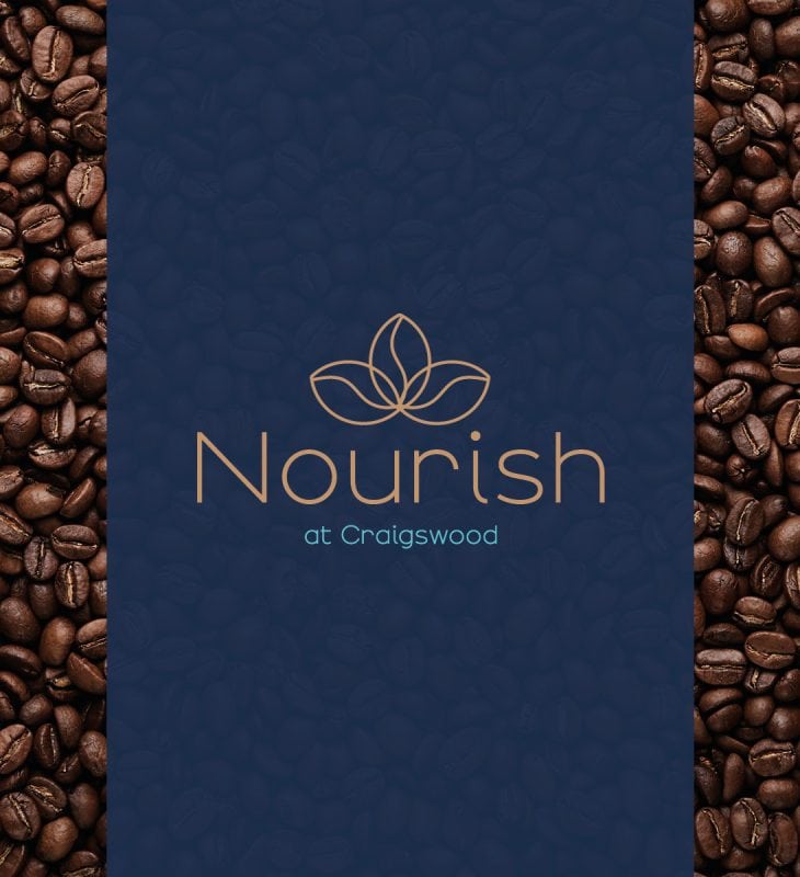
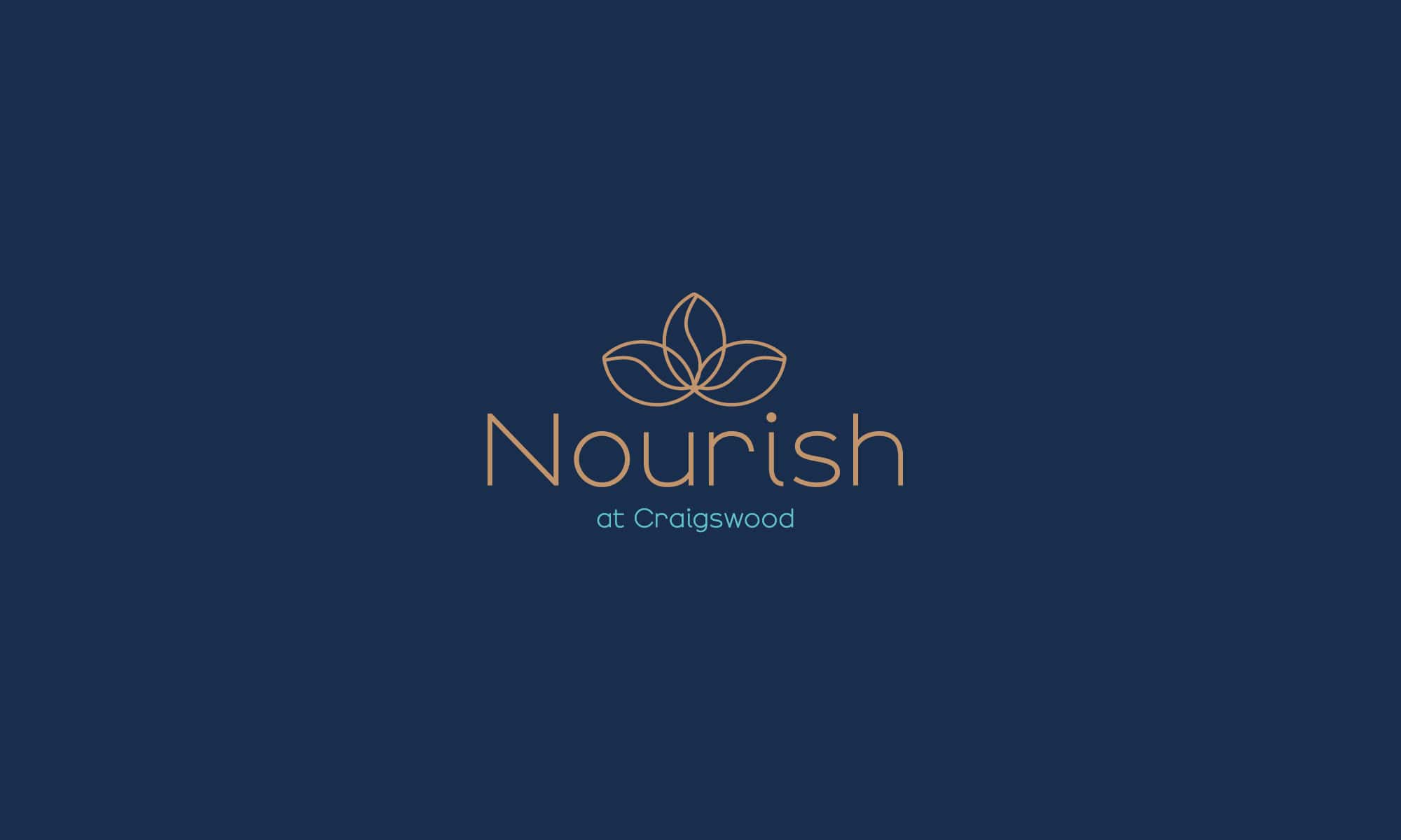
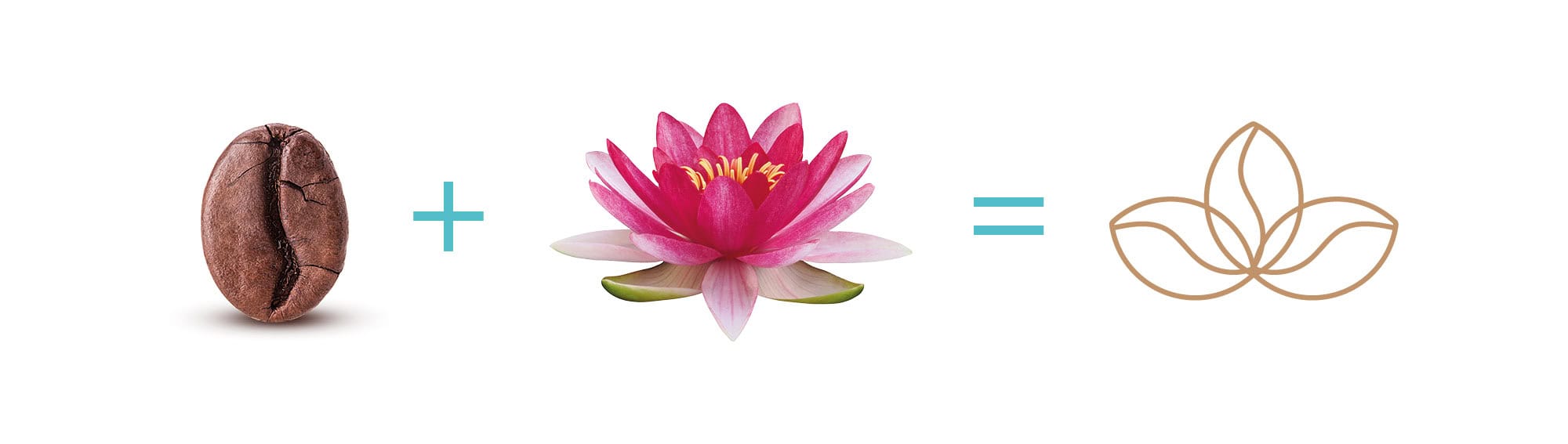
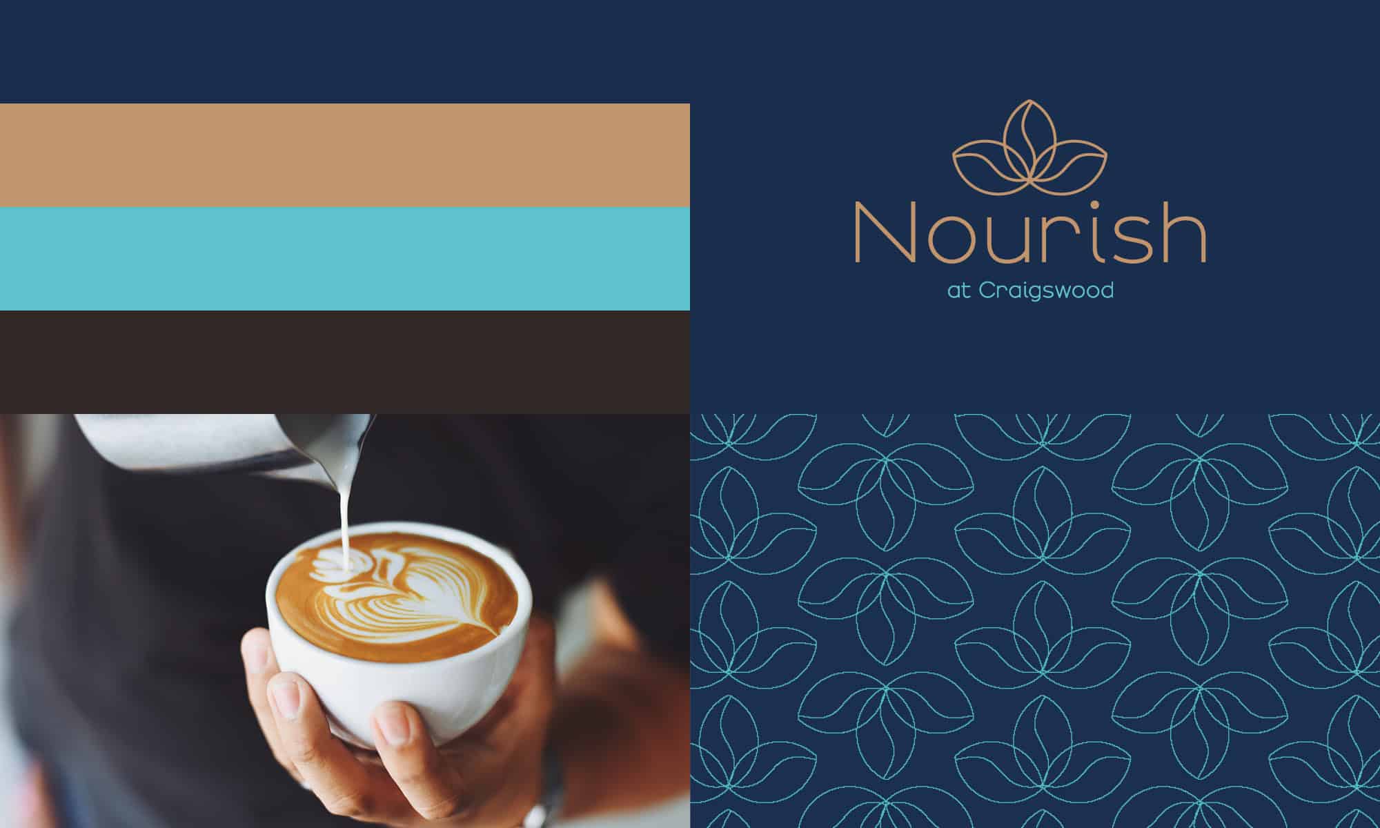
At the heart of the brand identity is a modern, clean logo that embodies the café’s focus on health and wellbeing. The logo features a symbol made from three coffee beans, representing nourishment and vitality, in line with the café’s mission to promote healthy living for leisure centre visitors. The design is minimalist, giving it a contemporary feel while ensuring versatility across various mediums.
A Sophisticated Palette with a Touch of Luxury
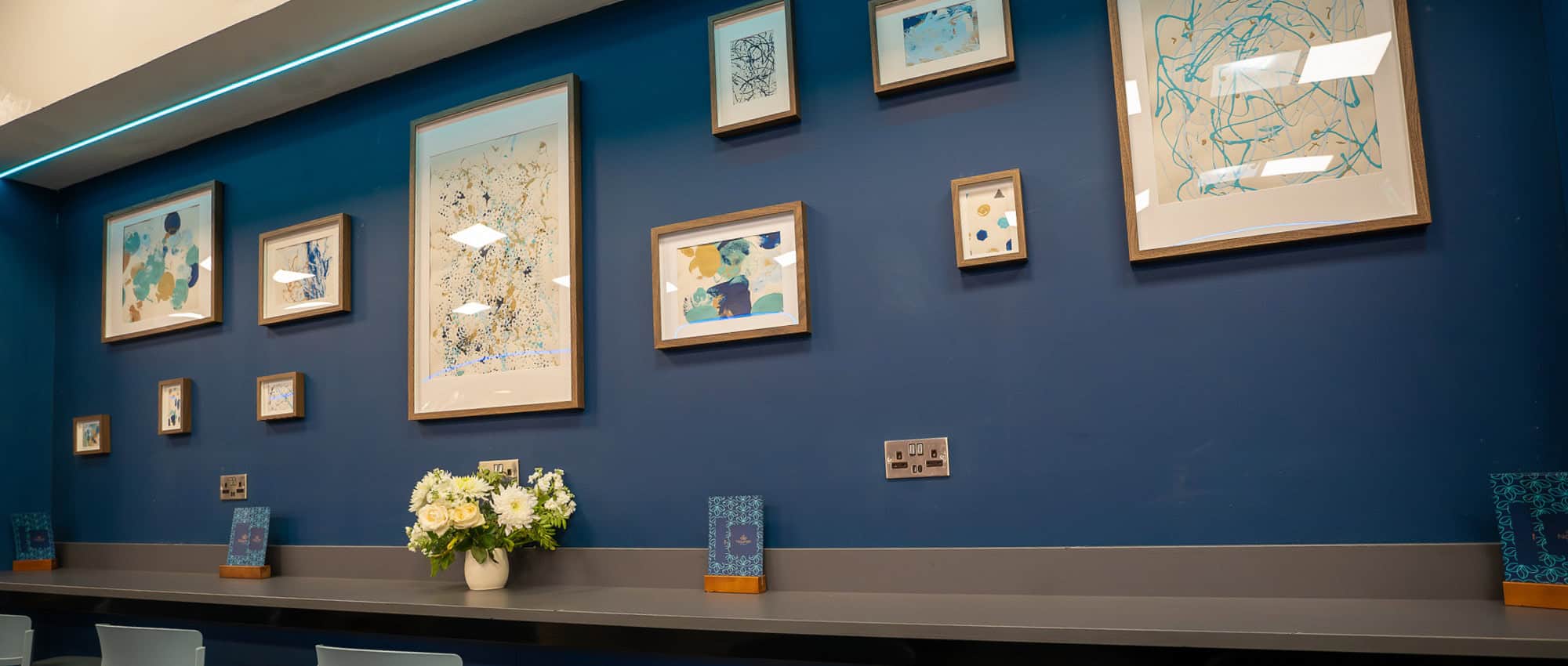
The colour palette consists of a soft turquoise paired with a deep navy blue, deep brown and gold. The palette remains grounded and sophisticated and touches of gold are introduced to add warmth and a subtle sense of luxury.
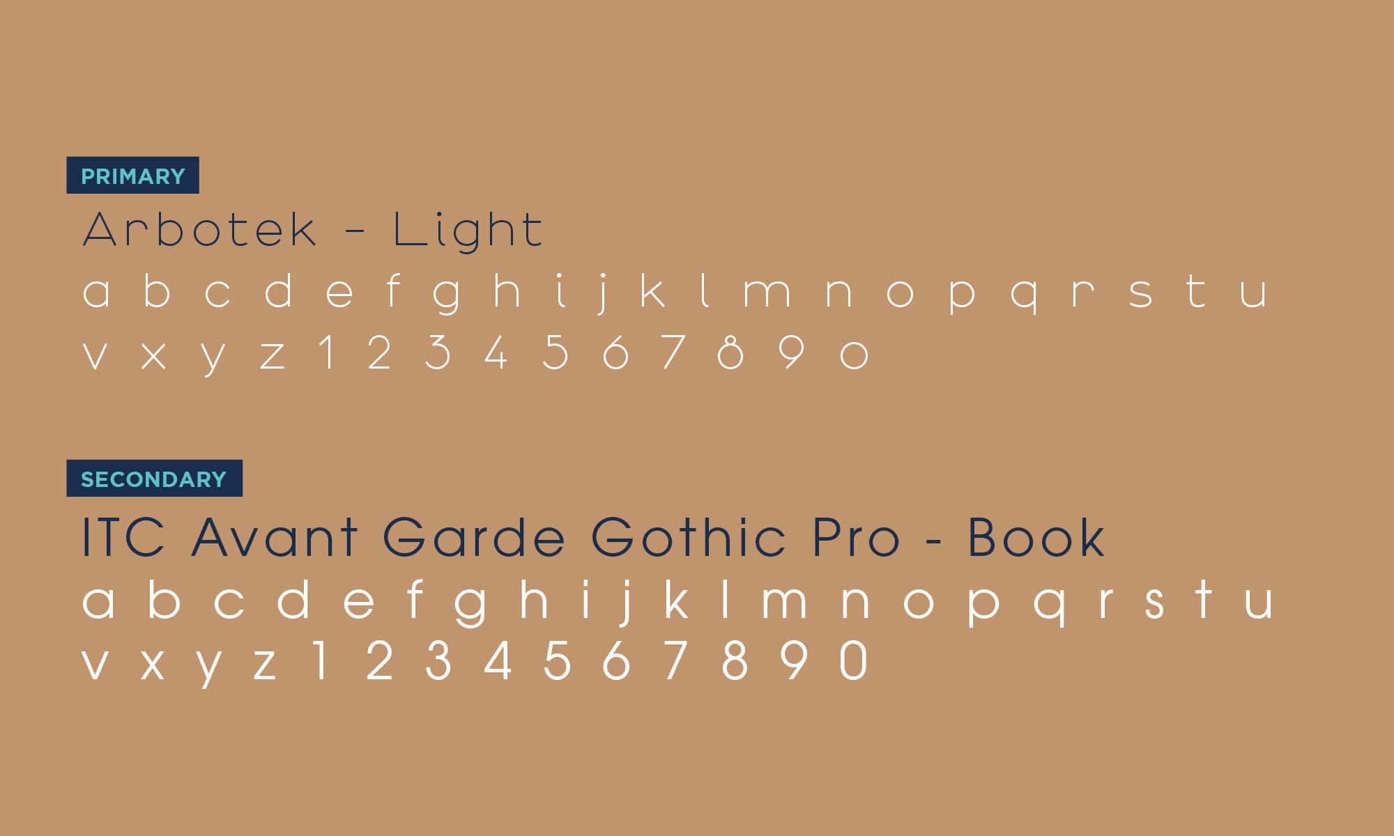
A Modern Typeface with an Elegant Touch
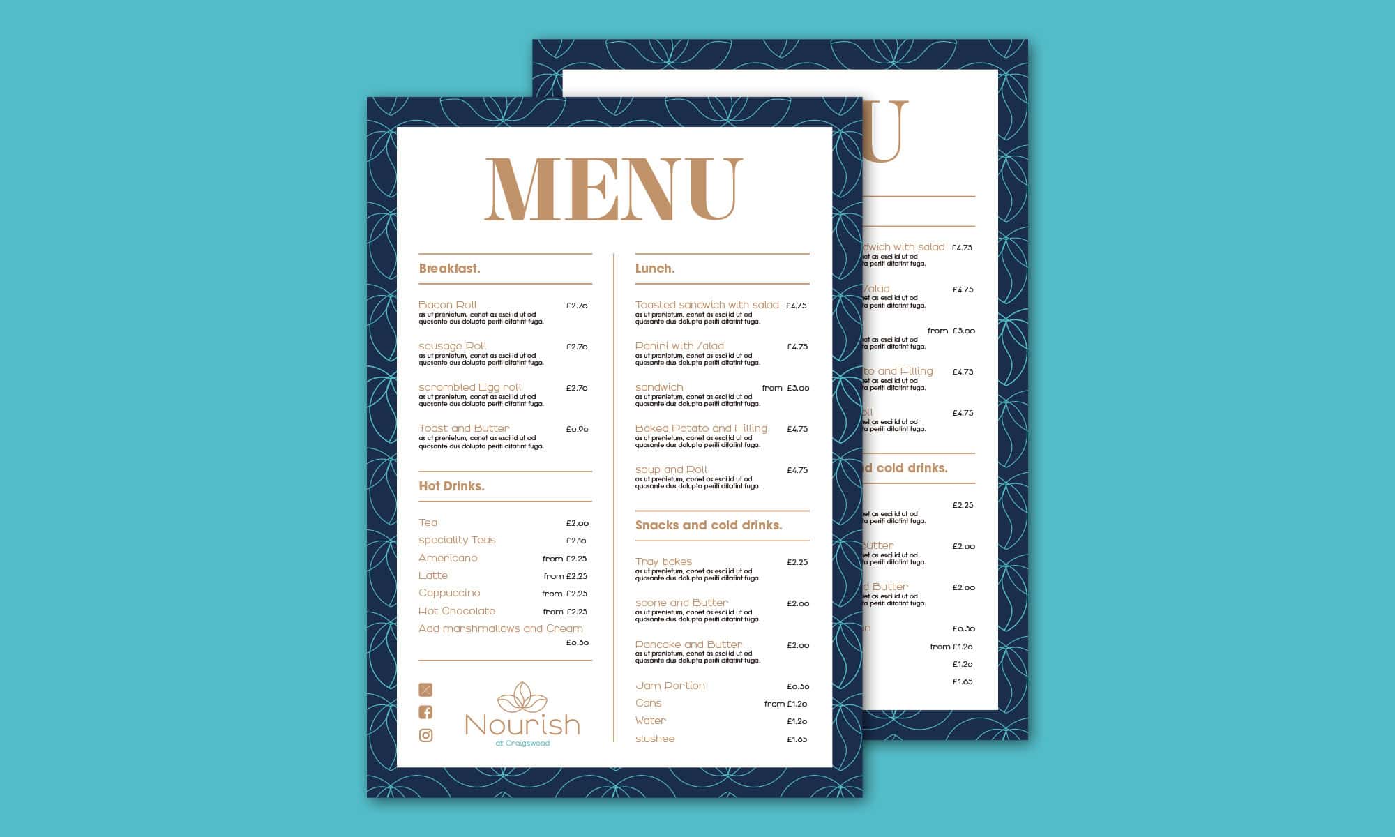
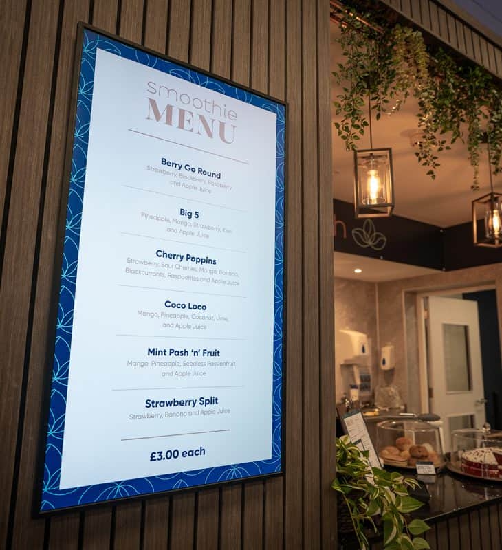
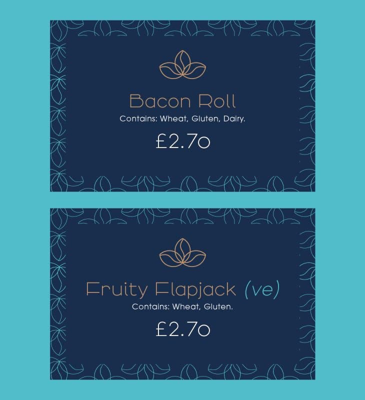
The typographic choices for Nourish Café balance modernity with clarity. The primary typeface, Arbitek Light, was chosen for its clean, structured form, lending a sense of elegance and simplicity to the brand. As a secondary font, ITC Avant Garde Gothic Pro Book complements this with its geometric feel, ensuring readability and creating a harmonious visual hierarchy across signage, menus, and digital platforms.
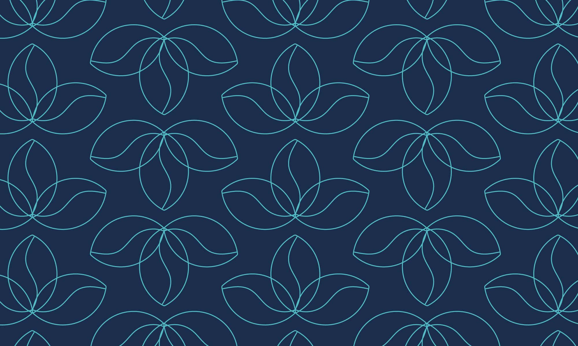
A Versatile Pattern for Enhanced Brand Recognition
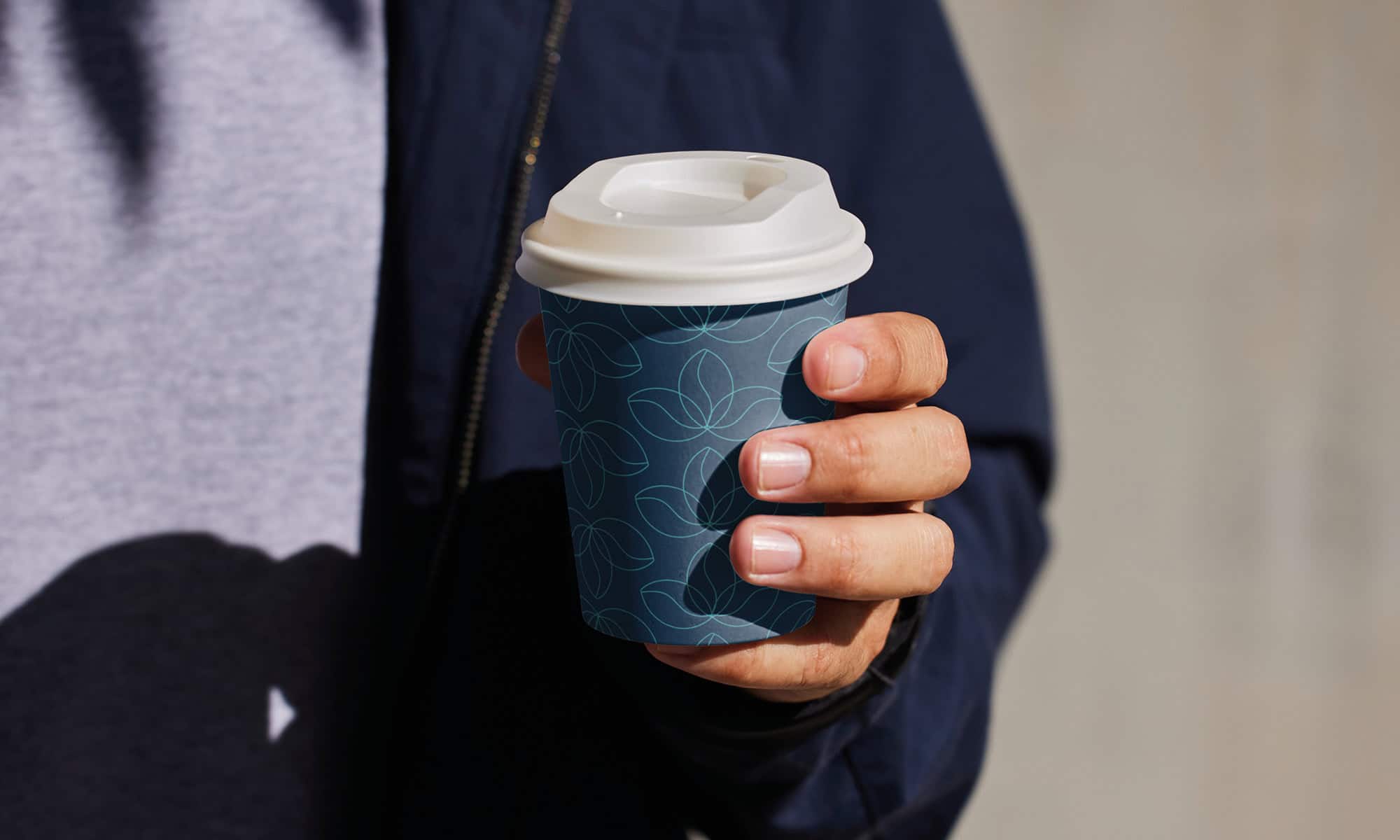
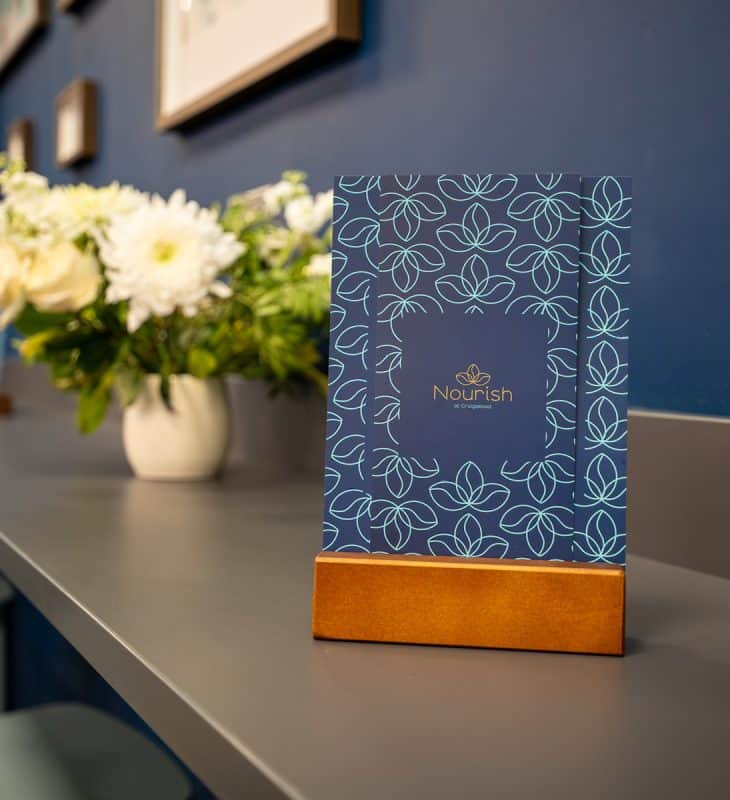
To extend the brand’s versatility, we created a seamless pattern derived from the logo’s coffee-bean symbol. This pattern provides a flexible visual tool that can be applied across multiple brand assets, from packaging to interiors and digital collateral. Whether used subtly in the background of menus or boldly on takeaway cups, the pattern reinforces brand recognition while remaining adaptable to various touchpoints.
Conclusion
The completed branding for Nourish Café at Xcite Craigswood Leisure Centre delivers a cohesive visual identity that aligns with the café’s mission of creating a calming, welcoming environment. By combining clean modern design elements with meaningful symbols, a thoughtful colour palette, and flexible typography, the brand now stands as a distinctive feature within the leisure centre, offering a place to relax for its visitors.