
Overview
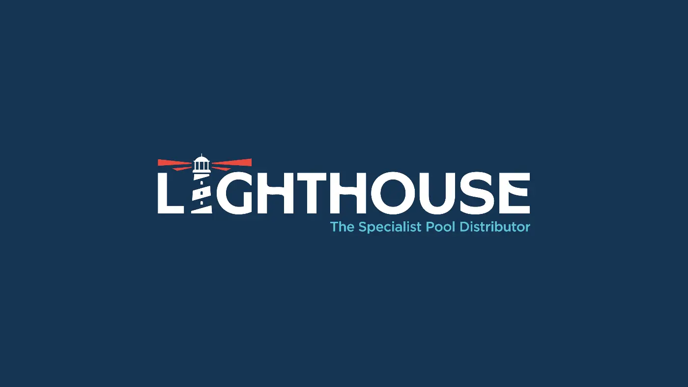
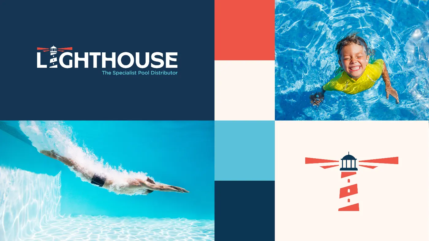
Lighthouse Pools, an independent pool distribution business based in Plymouth, approached us to help redefine their brand.
Our brief was to create a new visual identity, starting with a redesigned logo. We developed a colour palette centred on teal blue and navy to represent water, alongside red and white inspired by the Plymouth lighthouse and its maritime setting.
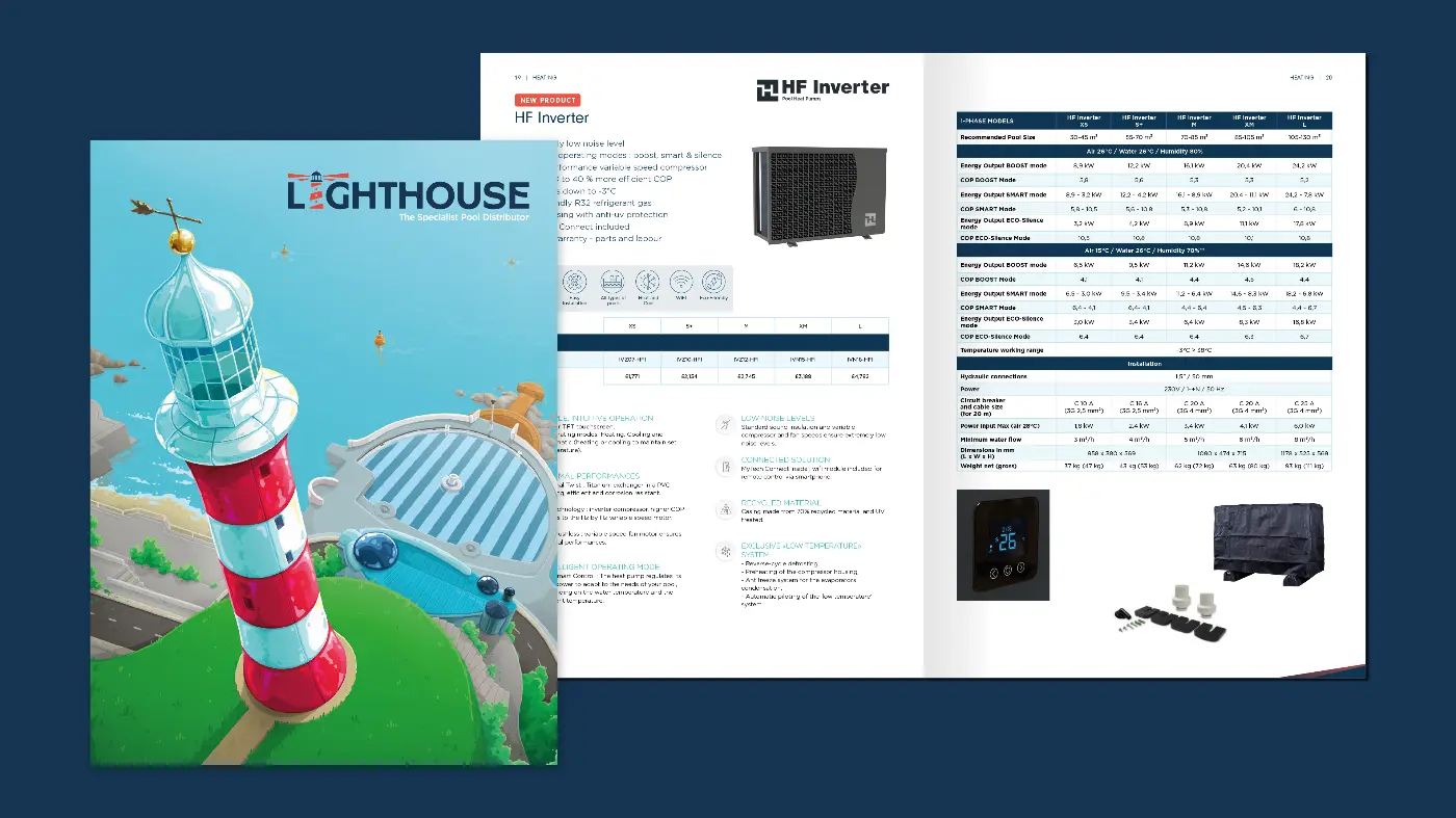

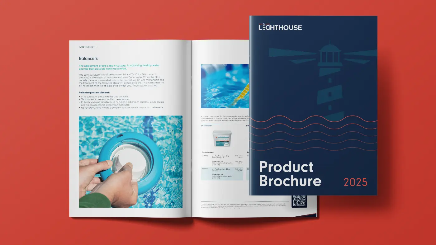
Product Brochure and Catalogue Design
A key part of the project was the design of both a product brochure and a comprehensive A4 product catalogue. This required a flexible system of different page layouts to accommodate varying product types, technical information and editorial content, as well as the integration of product adverts throughout.
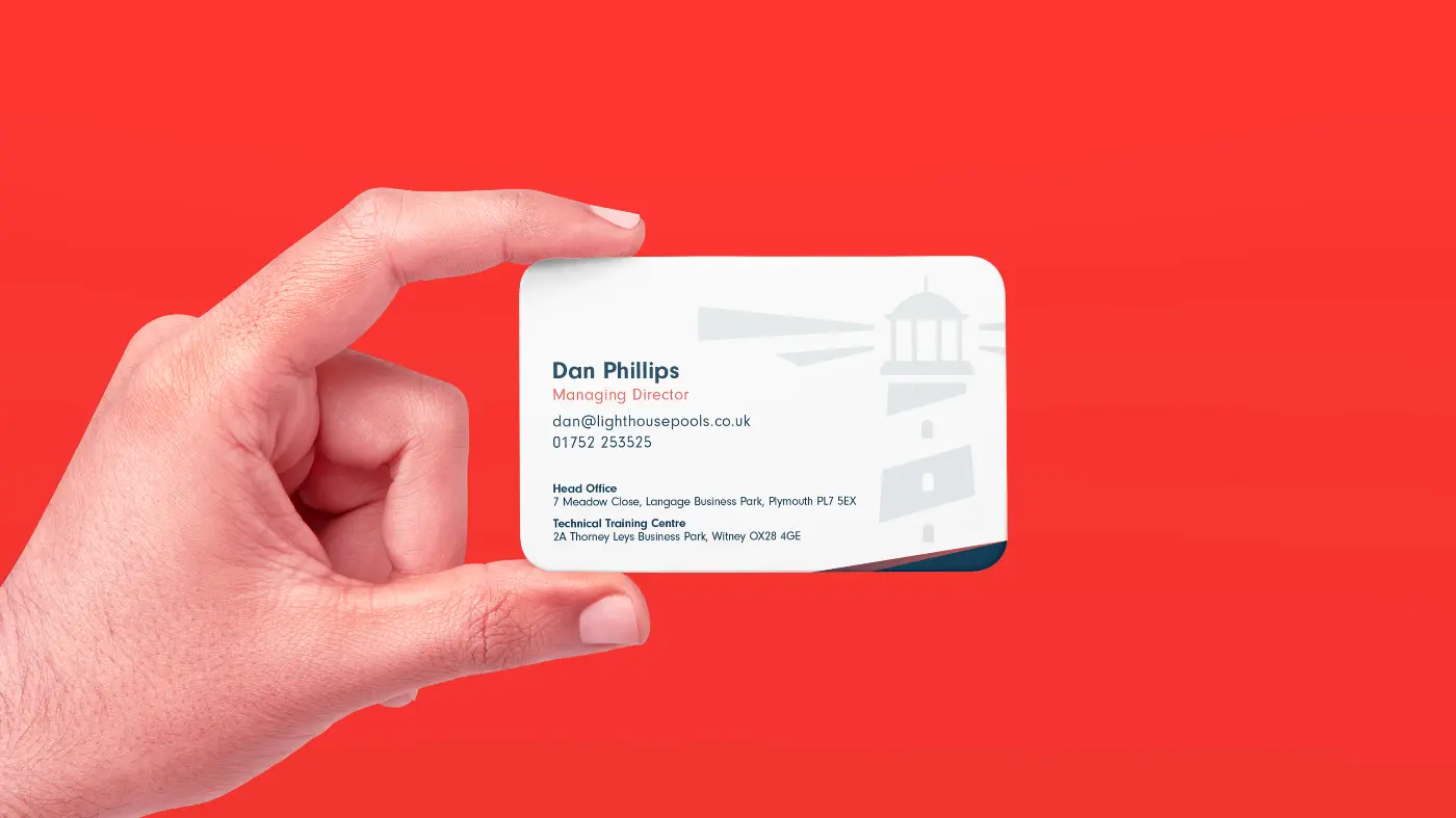

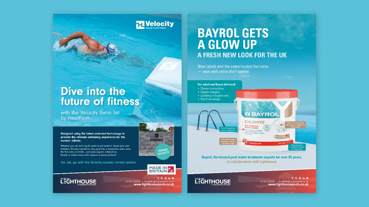
The identity was rolled out across a suite of brand touchpoints, including a magazine advert template, email footer and business cards.




In-house brand: HeatForm
Lighthouse Pools also operate an in house brand, HeatForm. We were asked to refresh the existing logo suite to create a more cohesive system, as well as design new HeatForm logos for upcoming products. This work was supported by a revised colour palette to strengthen recognition across the range.


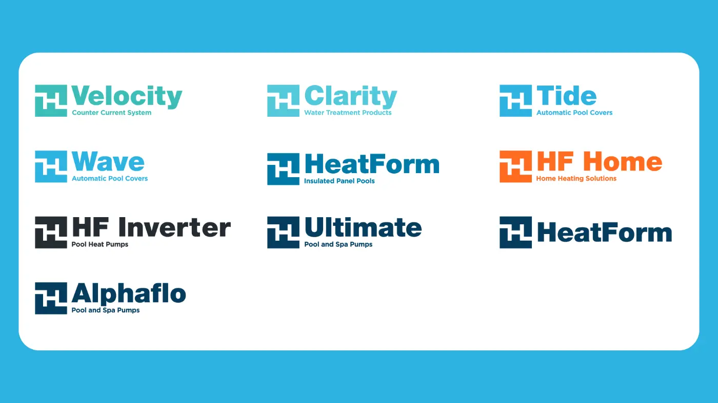
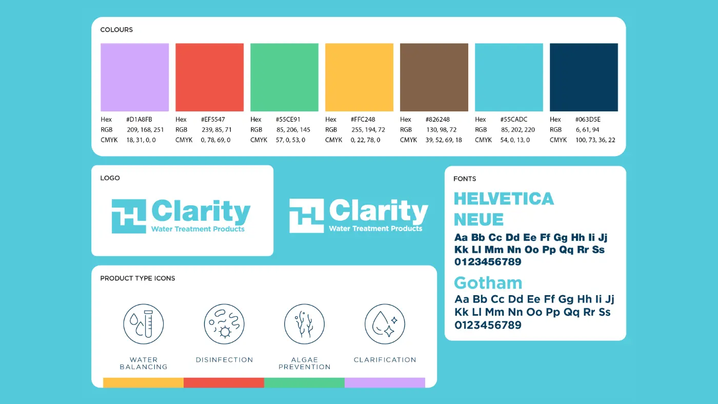

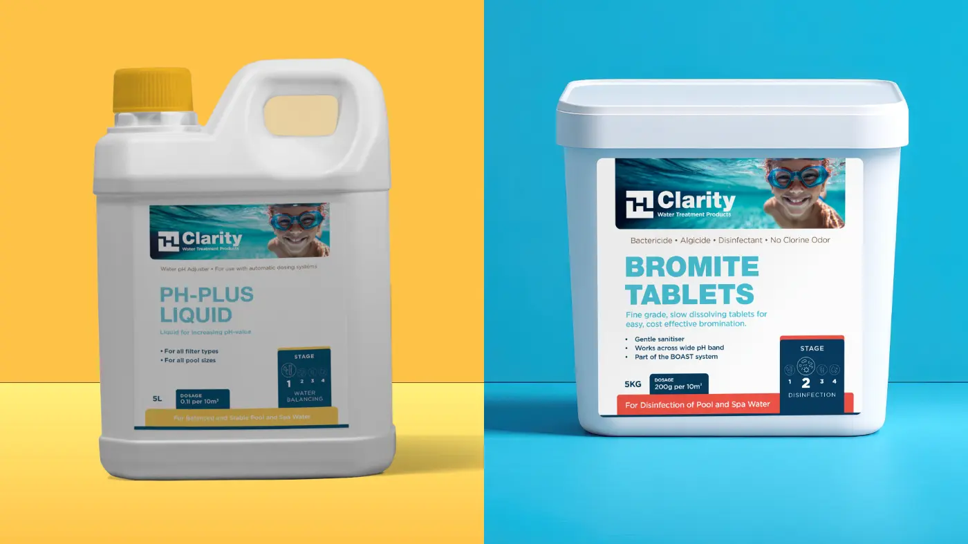
One of the new HeatForm brands, Clarity, is a water treatment product range. We developed a clear and flexible labelling system using four colours to distinguish the four stages of water treatment. Alongside this, we created a template to support white label products.
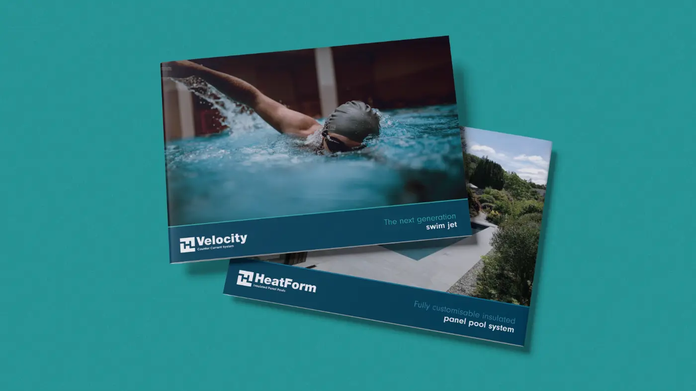


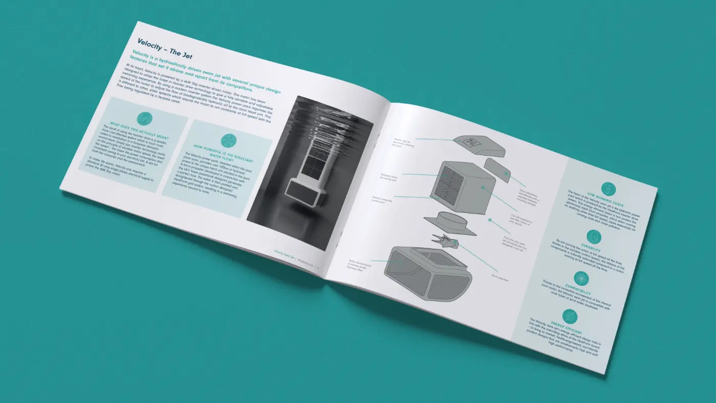
For HeatForm, we also designed a series of A5 product brochures. As part of this work, we created a set of icons used consistently across the brochures to simplify technical information.

To bring the brands to life digitally, we produced animated versions of the Lighthouse Pools and HeatForm logos for use across social media and as opening and closing assets for branded video content.
