
Overview
Greenlight provides apprenticeships, health and safety training, and safety consultancy services across the West and South West of England. As the organisation expanded, its existing brand no longer reflected the breadth of its offer or supported future growth.
Greenlight needed a complete brand refresh that could unite multiple services under a single group identity, while clearly differentiating each sub brand. The existing logo and visual system lacked clarity, flexibility and consistency across touchpoints.
Discovery and Strategy
We began with an initial alignment meeting to review Greenlight’s current brand assets, competitor landscape and marketing activity. This informed the scope of the project and set clear objectives for the rebrand.
A collaborative discovery session followed, bringing together key stakeholders across the business. Discussions focused on defining brand fundamentals, including mission, vision, values and brand architecture. We also reviewed competitors in detail to understand how Greenlight could stand apart in a crowded sector.
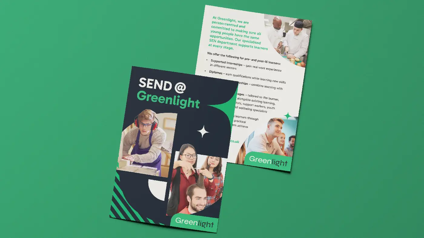
A key outcome was the need to differentiate between safety consultancy, training and apprenticeships, and the safety assessment scheme, while maintaining a cohesive group brand.
Brand Identity
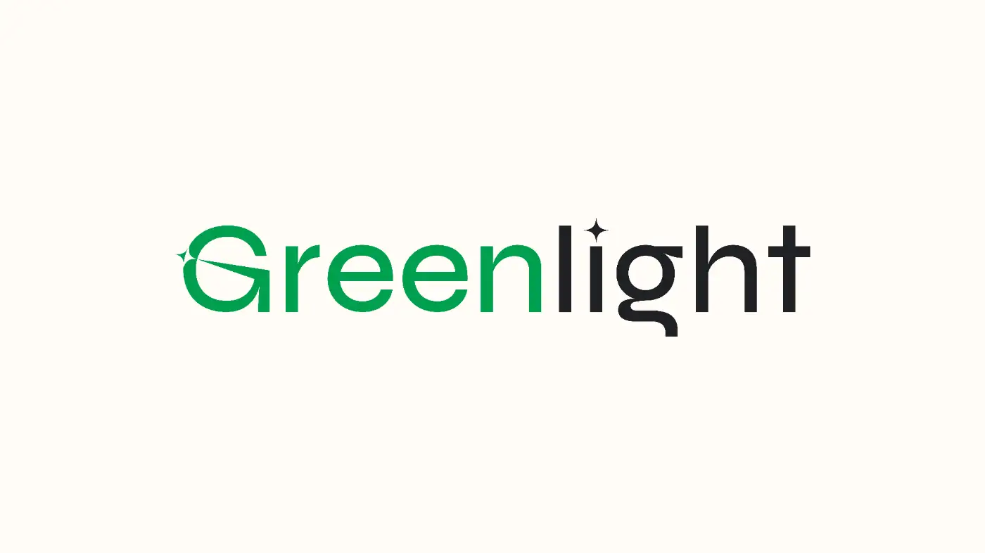
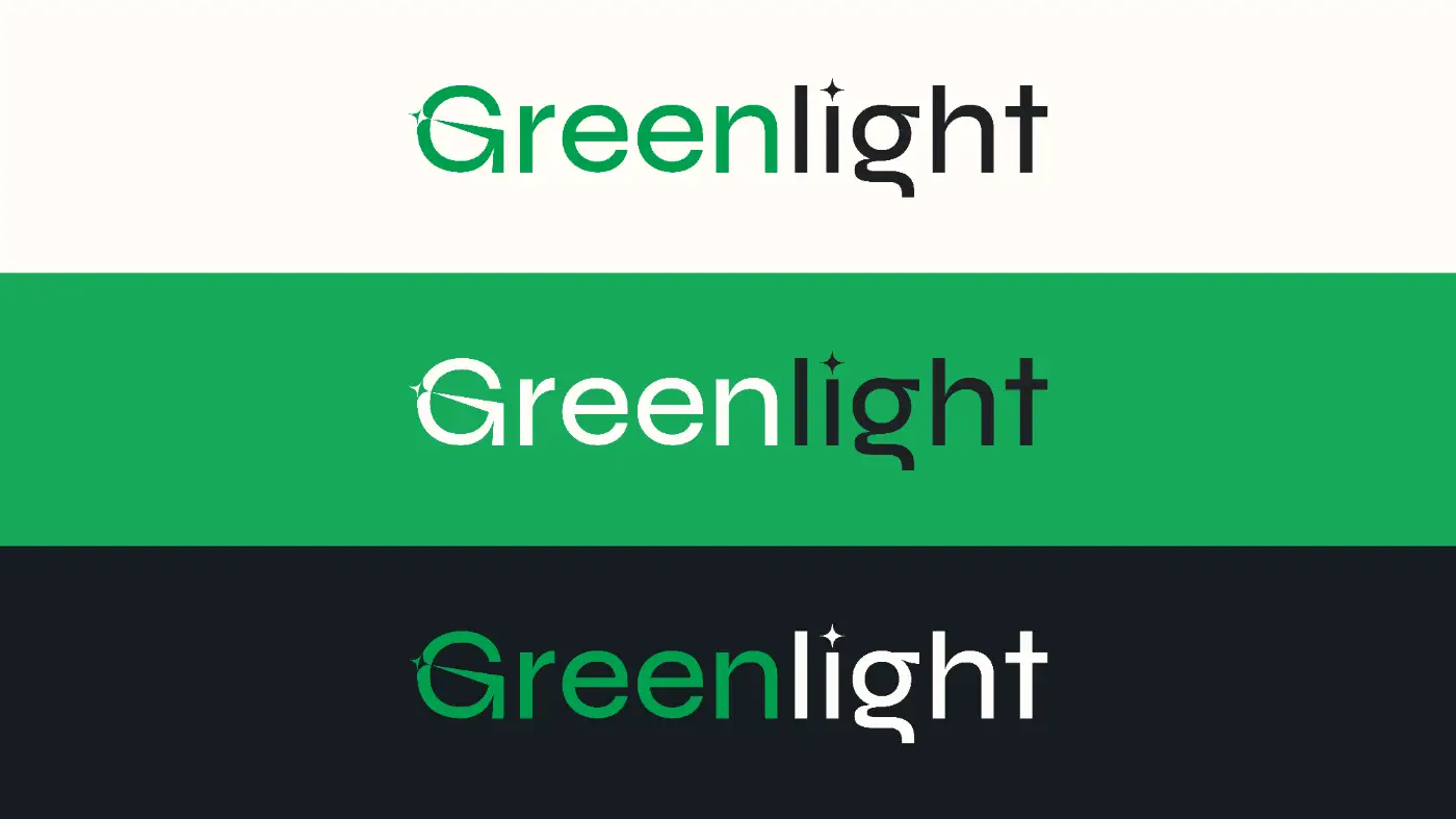
It became clear that the existing logo was no longer fit for purpose. We explored multiple logo concepts before refining the final direction.
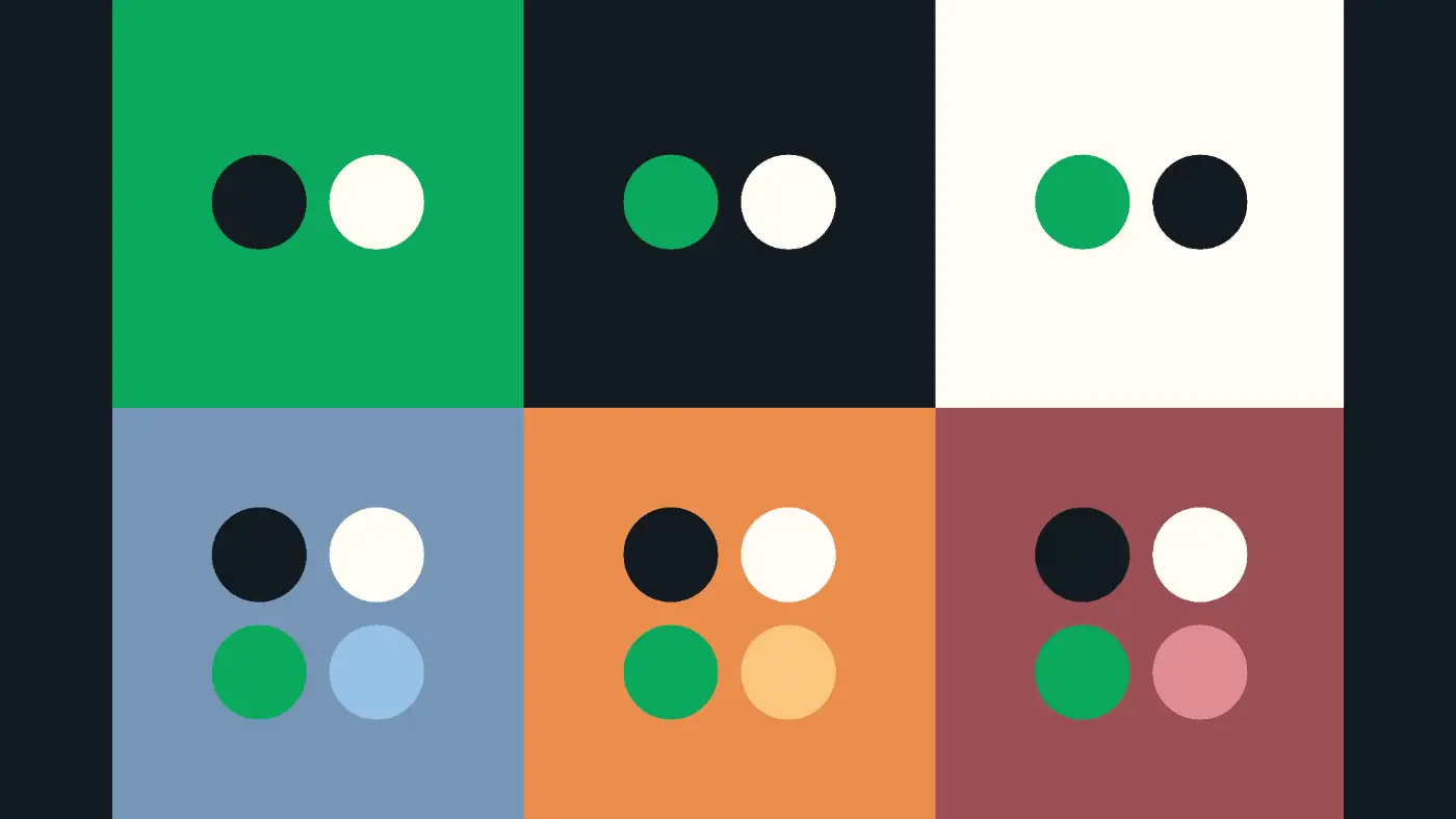
The chosen identity uses green and dark grey to create a modern, professional and approachable look. The new logo system provides a flexible foundation that flows seamlessly across all services under the Greenlight group.

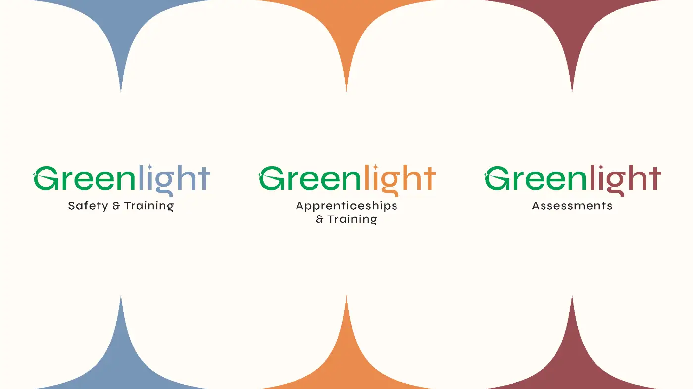
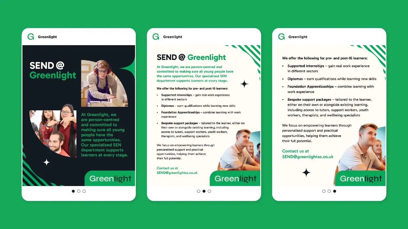
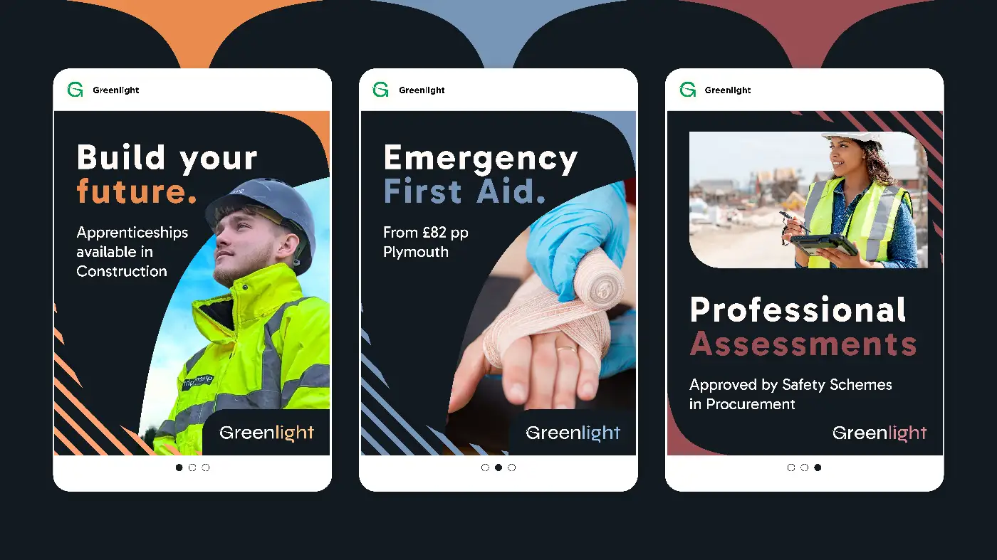
Sub Brand System
A secondary colour palette was developed to support the individual sub brands. Each sub brand received its own logo, designed to work independently while remaining visually connected to the parent brand.
This approach ensures clarity for different audiences without fragmenting the overall identity.
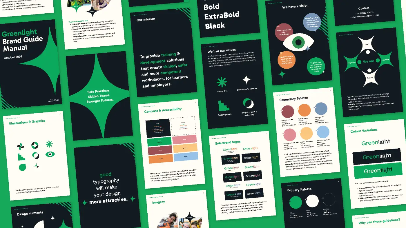
Brand Guidelines
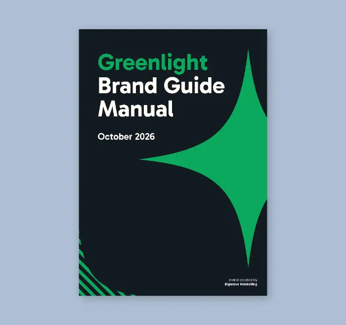
To support consistent application, we created a comprehensive brand guidelines document. This covered logo usage, colour and typography, iconography and photography, providing clear direction for all future brand activity.
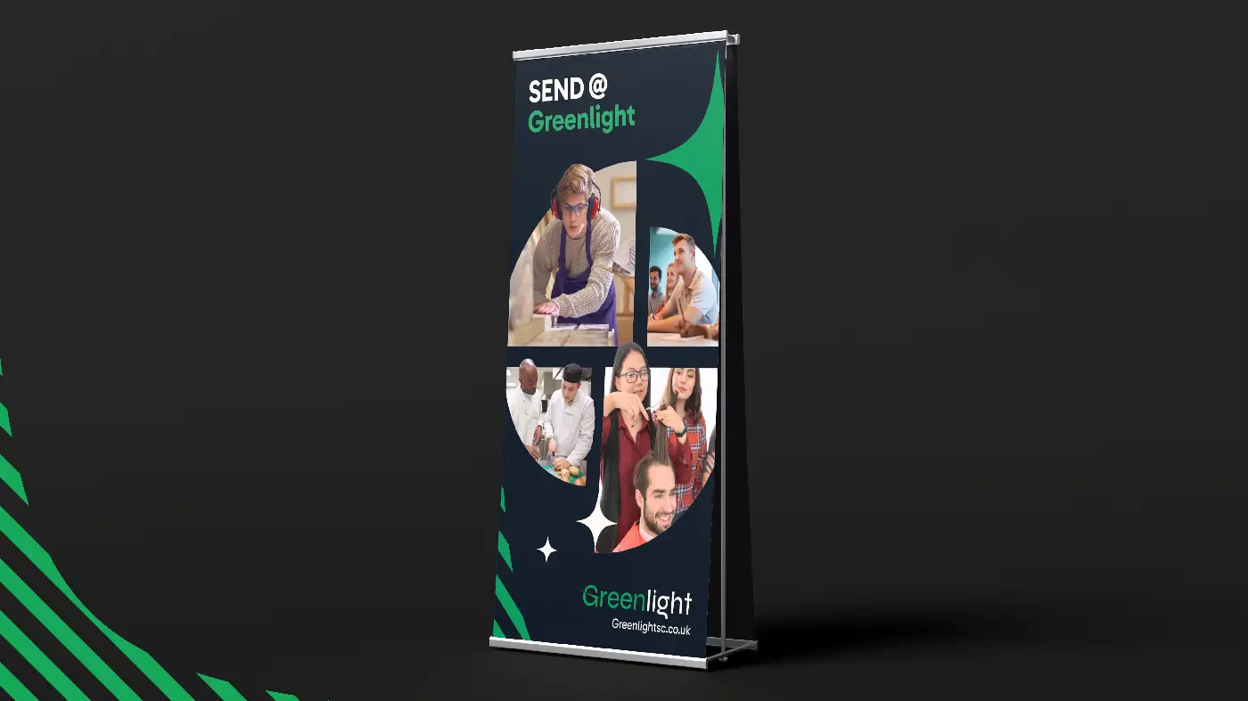
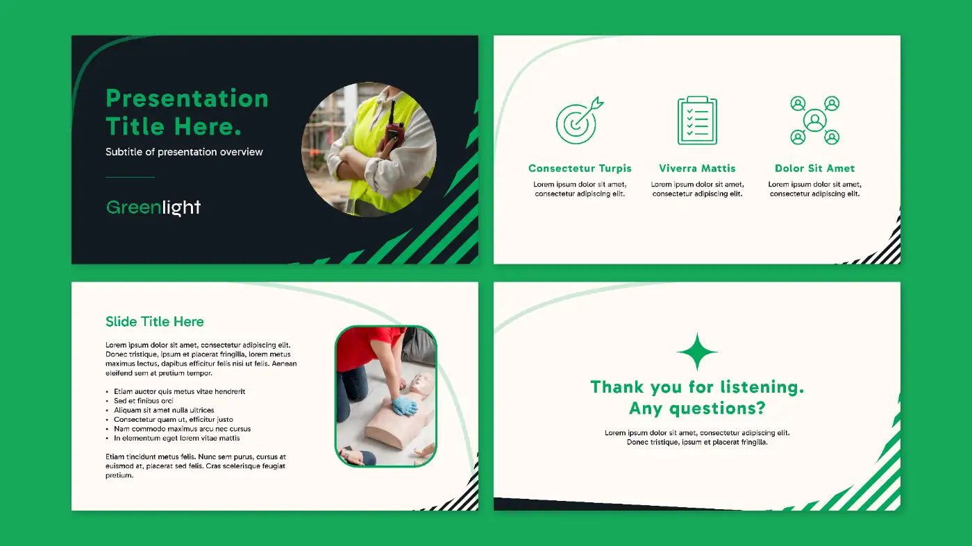
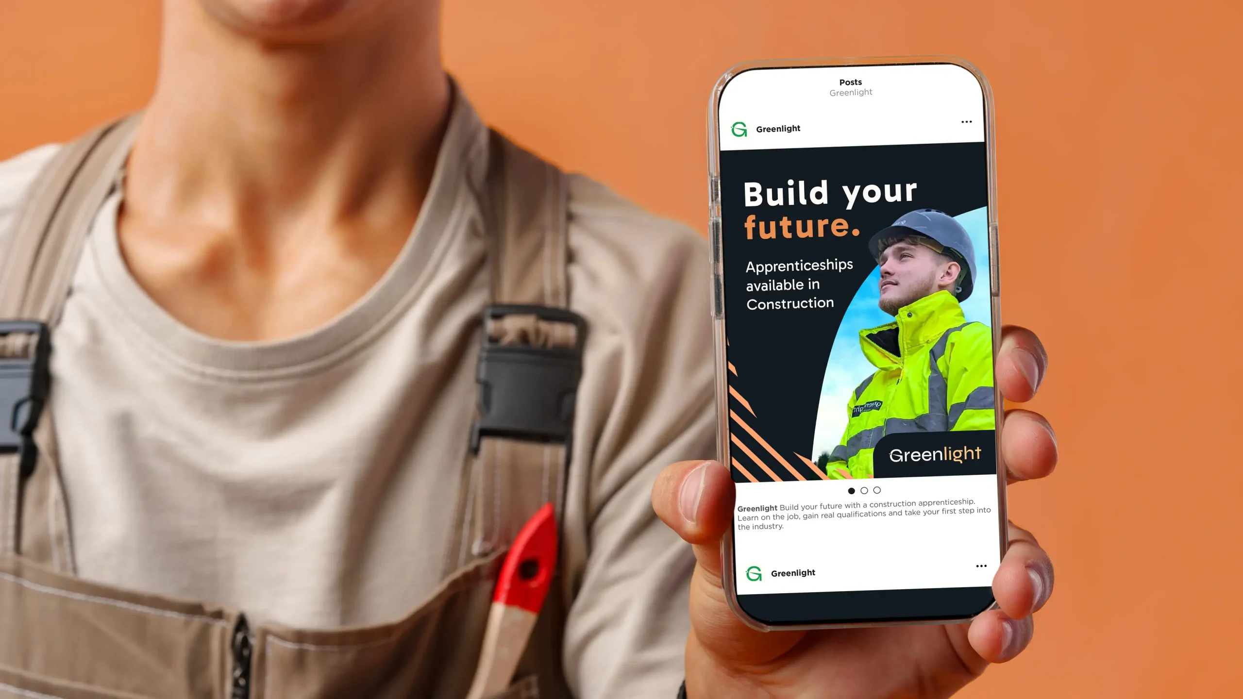
Rollout and Assets
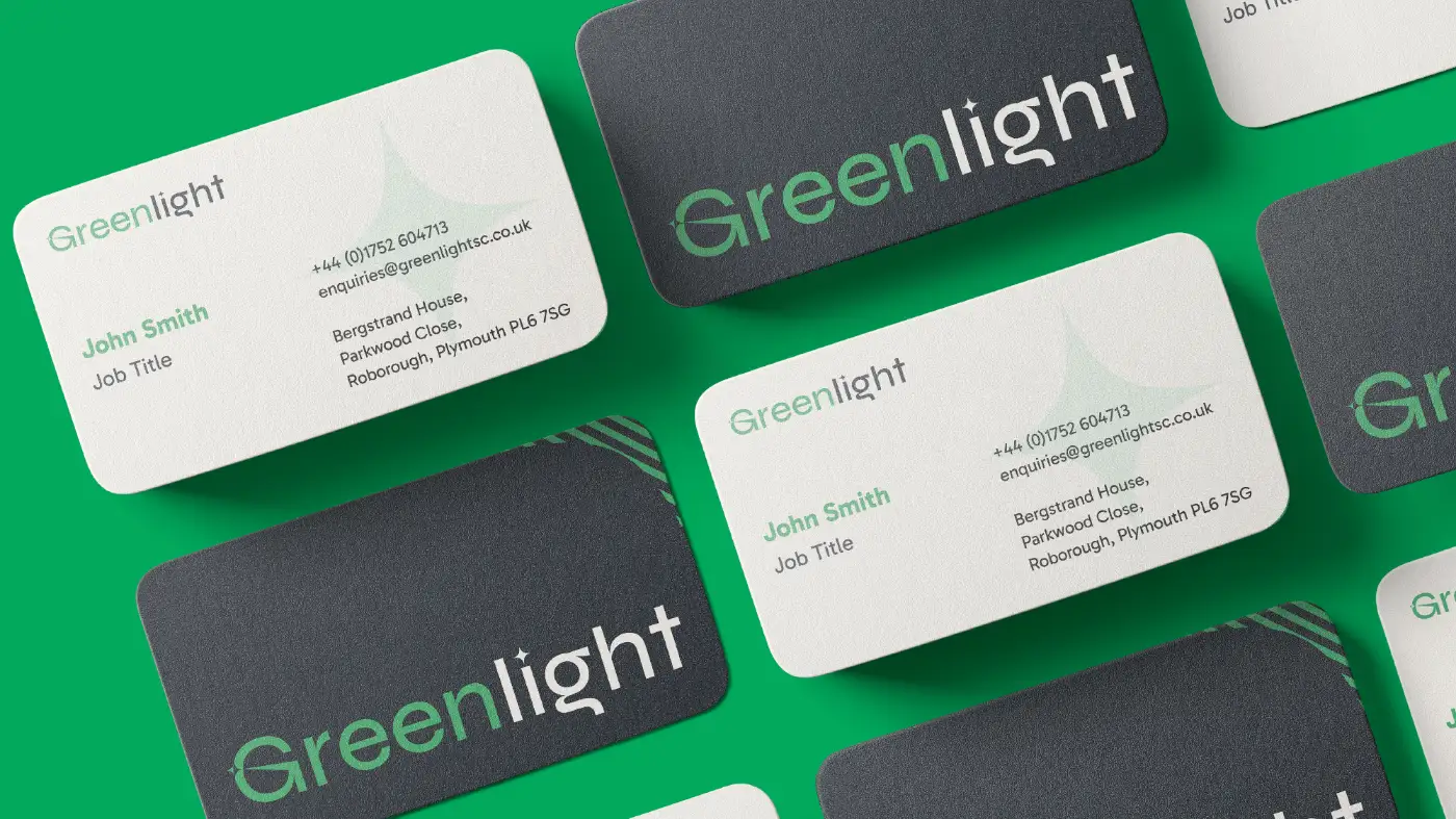
We designed a suite of practical templates, including business cards, PowerPoint presentations and social media graphics, to ensure the brand could be applied easily and consistently.
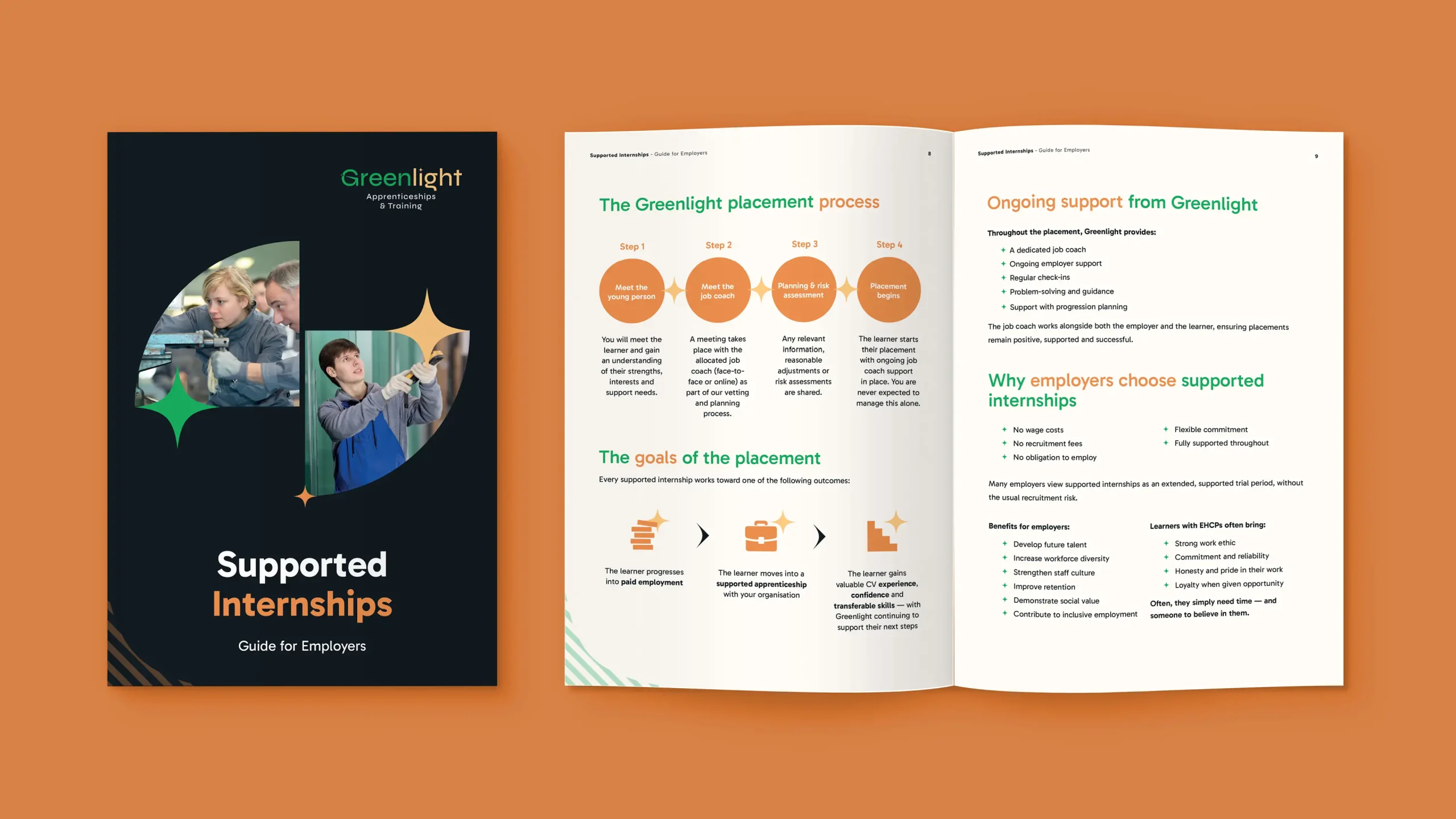
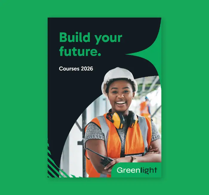
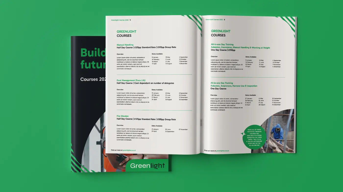
The project concluded with the design of a course brochure, bringing the new identity to life across a key customer touchpoint.